Building a Design System for ArchiPro
- Client
- ArchiPro
- COMPLETION
- 2022 - 7 months
- PLATFORM
- SaaS, E-commerce, Web App, Responsive Website
- MY ROLE
- As the project's UX/UI Designer, I expanded and managed the design system with the team and collaborated with the design and engineering teams throughout the project.
- TEAM
- Mark Kiewiet(Head of Design), Jerry Li(Product Designer), Jason Liao(Engineer), Marwan Fikrat(Engineer)

The Challenge
The ArchiPro platform UI redesign was completed and signed off in mid-2022. However, the new UI ArchiPro platform faced a significant challenge: the need for a formal design system. This system would serve as a centralised resource hub, enabling designers and developers to access the necessary tools and guidelines, ensuring a consistent and efficient approach to product development.
What Is a Design System?
A Design System is a systematic approach to product development complete with guidelines, processes, components, and code. It is a single source of truth for teams that simplifies product creation, testing, and development and ensures consistency across different pages and channels.
Why We Need a Design System?
The latest UI ArchiPro platform Figma file shows various styling discrepancies, creating inefficiencies, inconsistencies, and potential challenges for agile solutions. Additionally, duplicated standard components could lead to siloed teams with disjointed communication.
How To Develop a Design System?
Developing a design system is a team effort that involves everyone, from designers and developers to stakeholders and brands. As the designer spearheading this initiative, I've gathered and consolidated all stakeholders' input to create a unified platform that houses this valuable information. We aimed to develop a centralised design system to achieve the following:
- Align our teams by providing a structured and guided approach to product development.
- Enhance our design and development process with a pre-built library and patterns team for creating and testing layouts, ultimately saving time.
- Reduce complexity and ambiguity.
- Improve brand perception and user trust through consistent, universally compelling experiences that help users achieve their goals.
Where To Start?
We recognised that this project would demand substantial resources, careful planning, and significant time commitments. However, we were confident that this endeavour was a justified long-term investment, benefiting our company, brand standards, and, most importantly, our valued customers.
We ran the design sprint and process following steps by creating a design system.
- Find all styles of the new UI pages in Figma.
- Find all the components of the new UI pages in Figma.
- Define the layout and the spacing.
- Creation of Styles. Colour, text styles, shadow, etc.
- Creation of Components: button, input, dropdown, modals etc.
- Build Screens: mobile, tablet and responsive desktop.
- Document the usage of styles and components in Figma to share it with stakeholders and developers.
- Developer to create styles and components for the Storybook.
- Developers to implement styles and components to the platform.
- Test and Launch.
The Design System anatomy
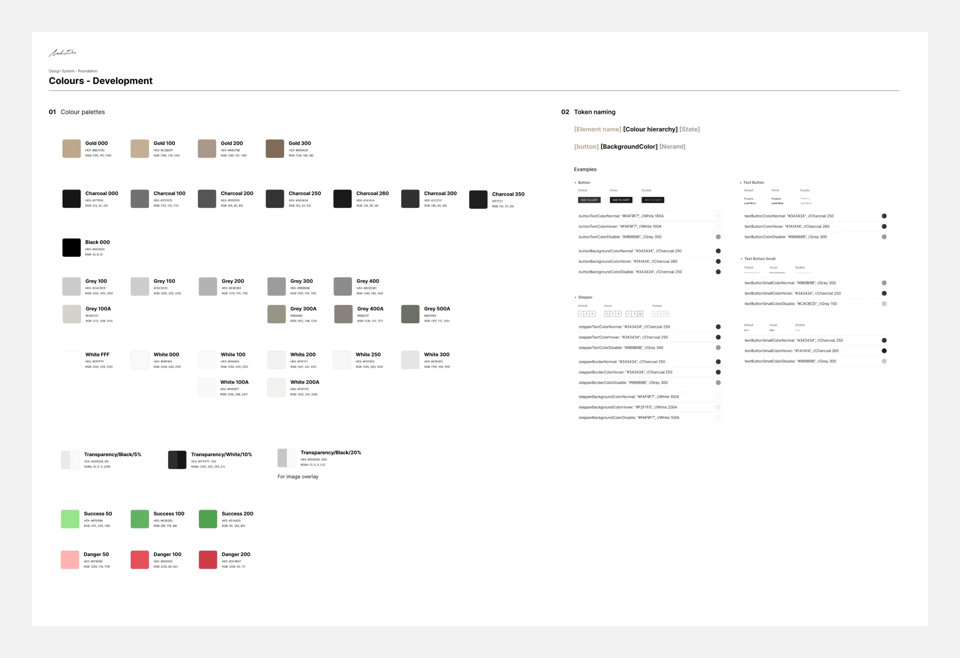
Colours
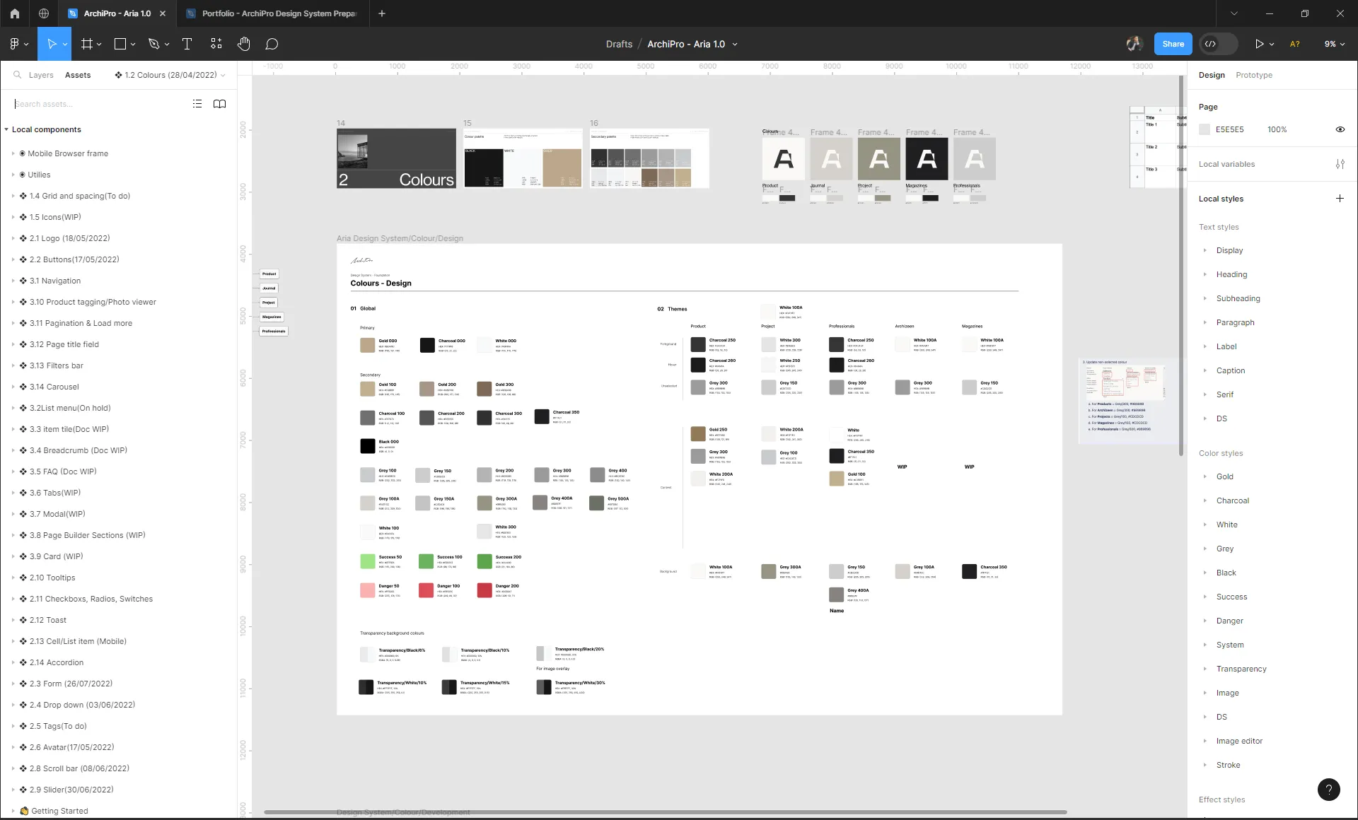
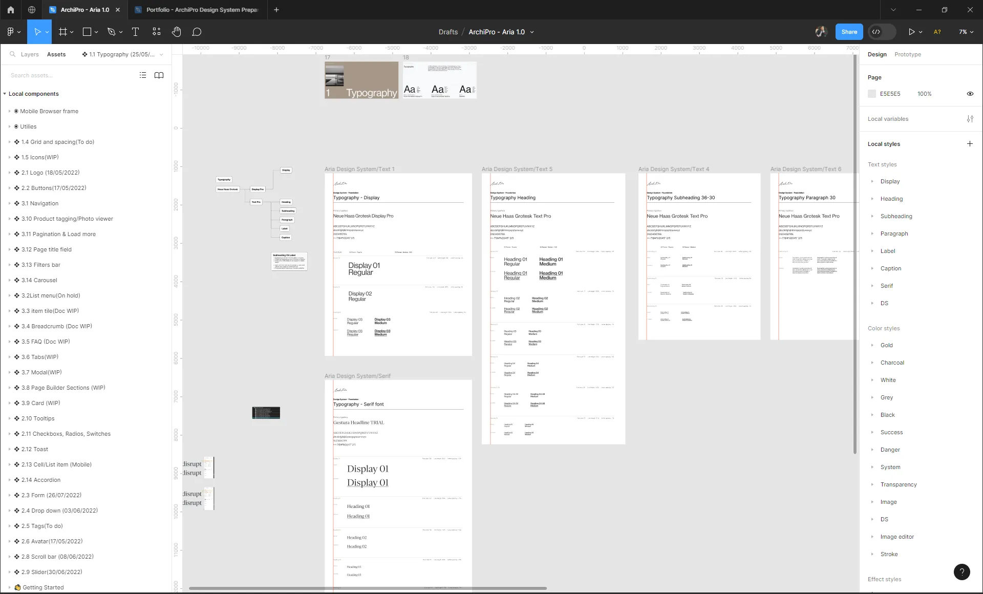
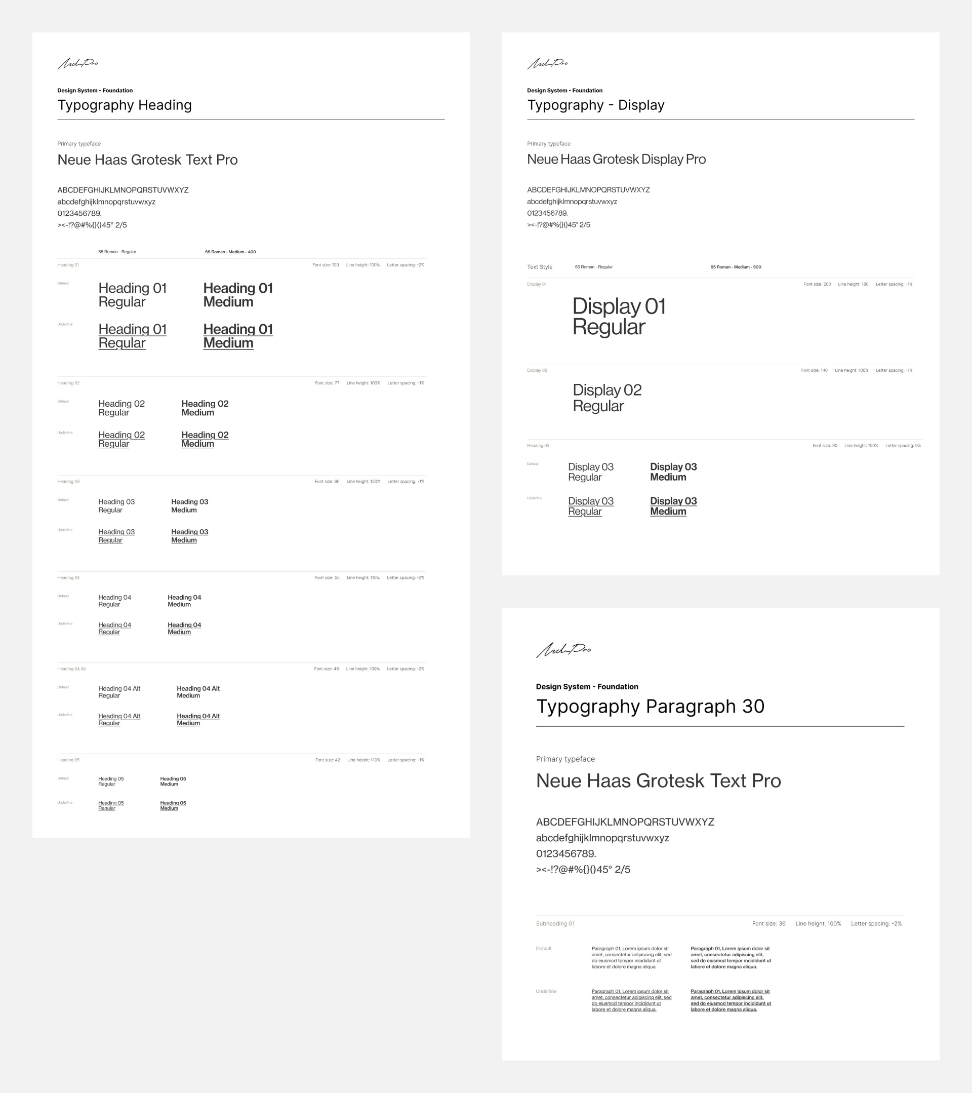
Typography
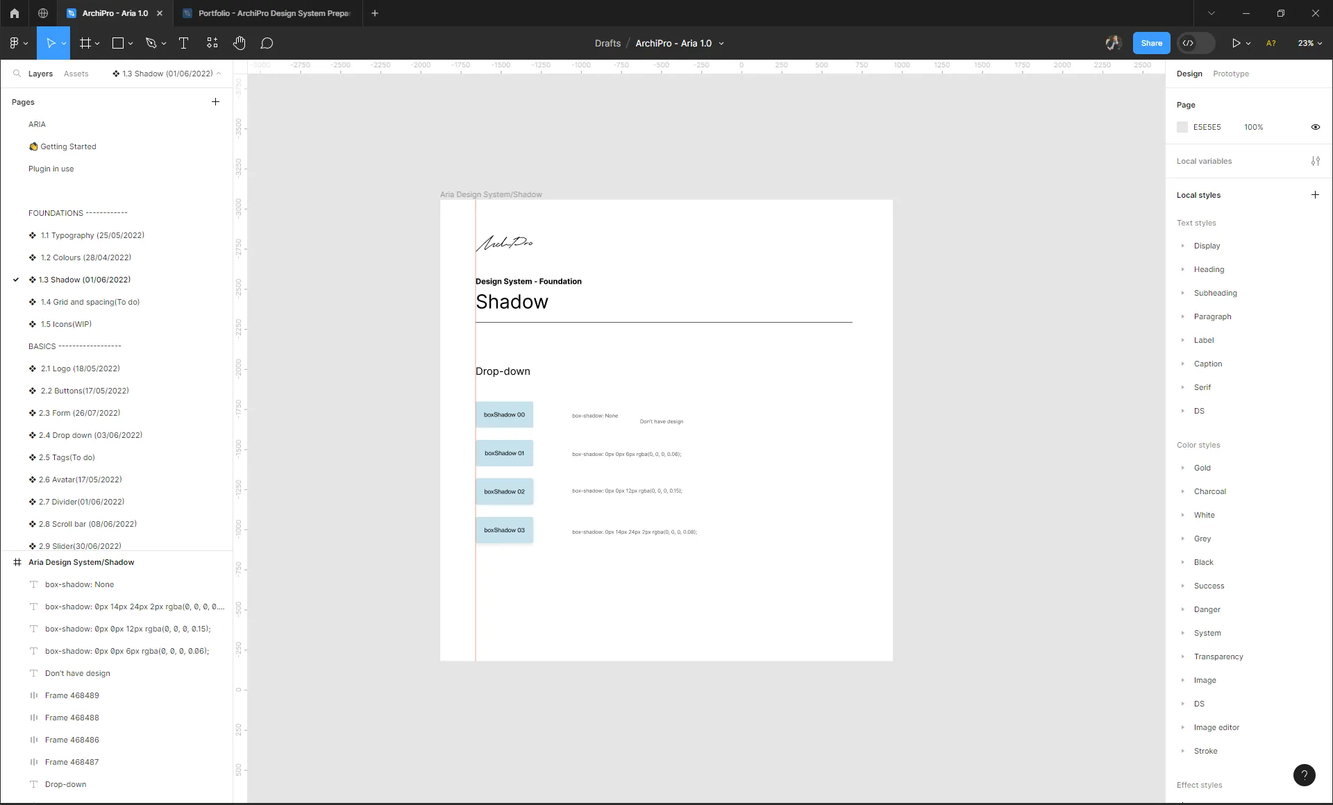
Miscellaneous Styles
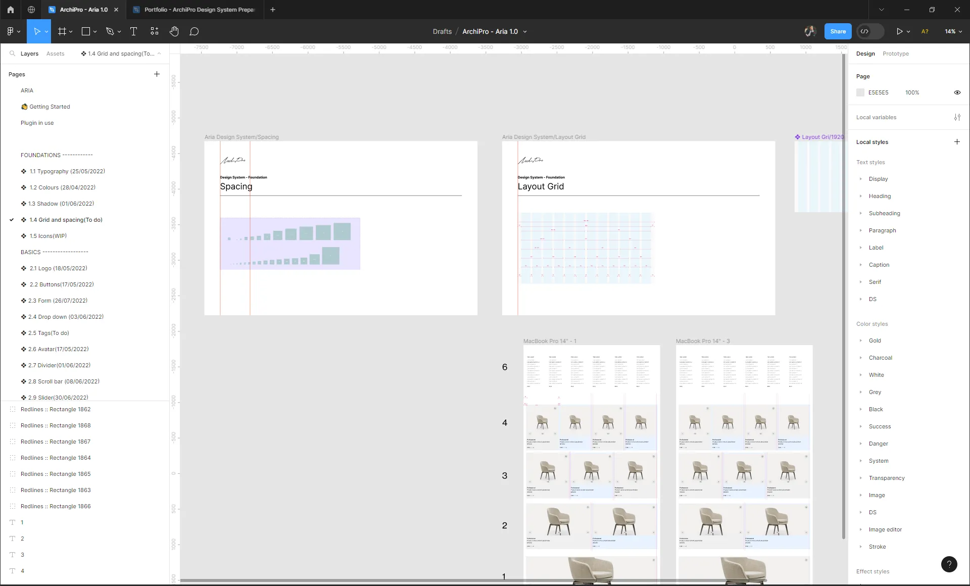
Spacing Grid and Layout
Components
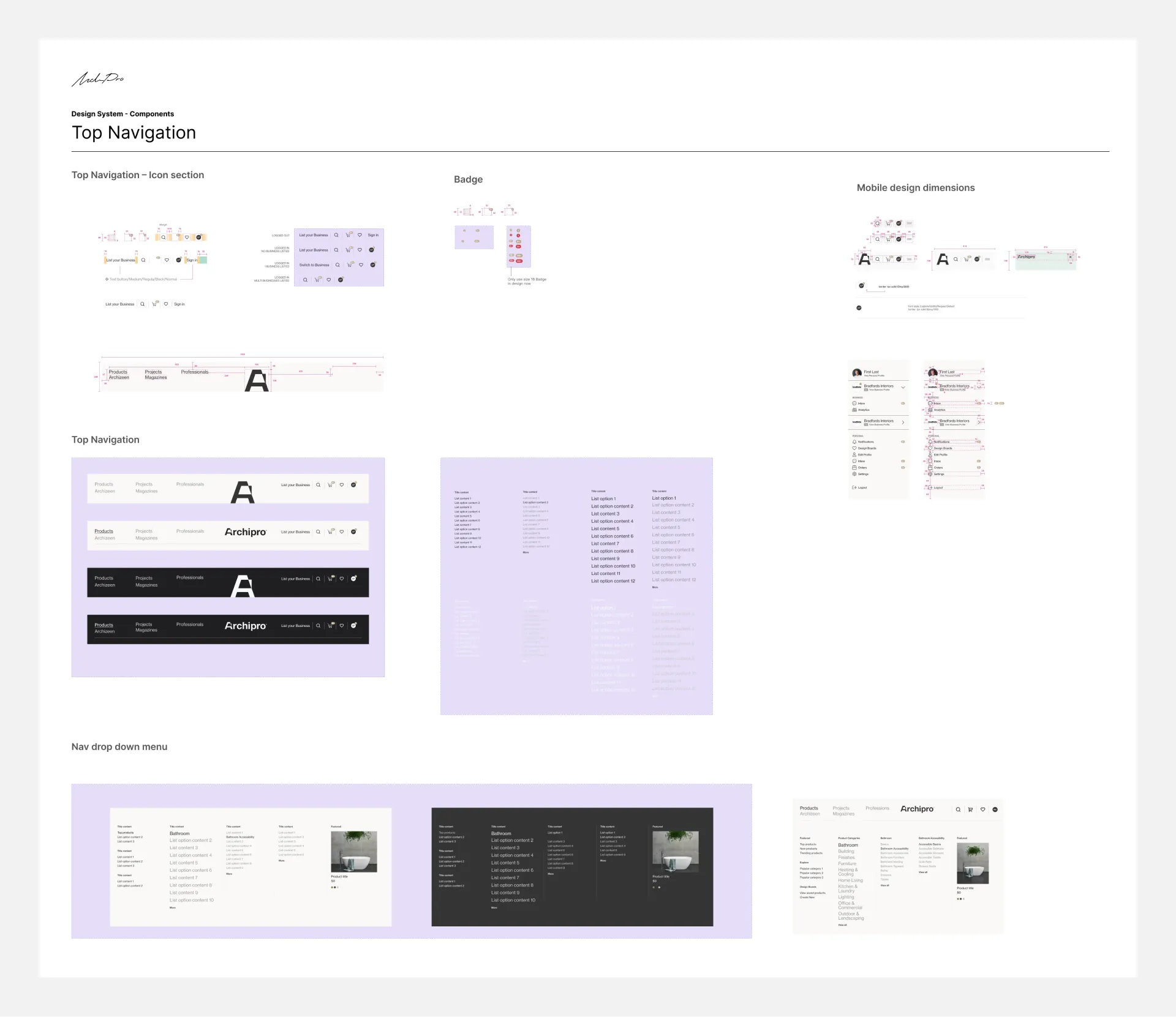
List of components:
- Icons
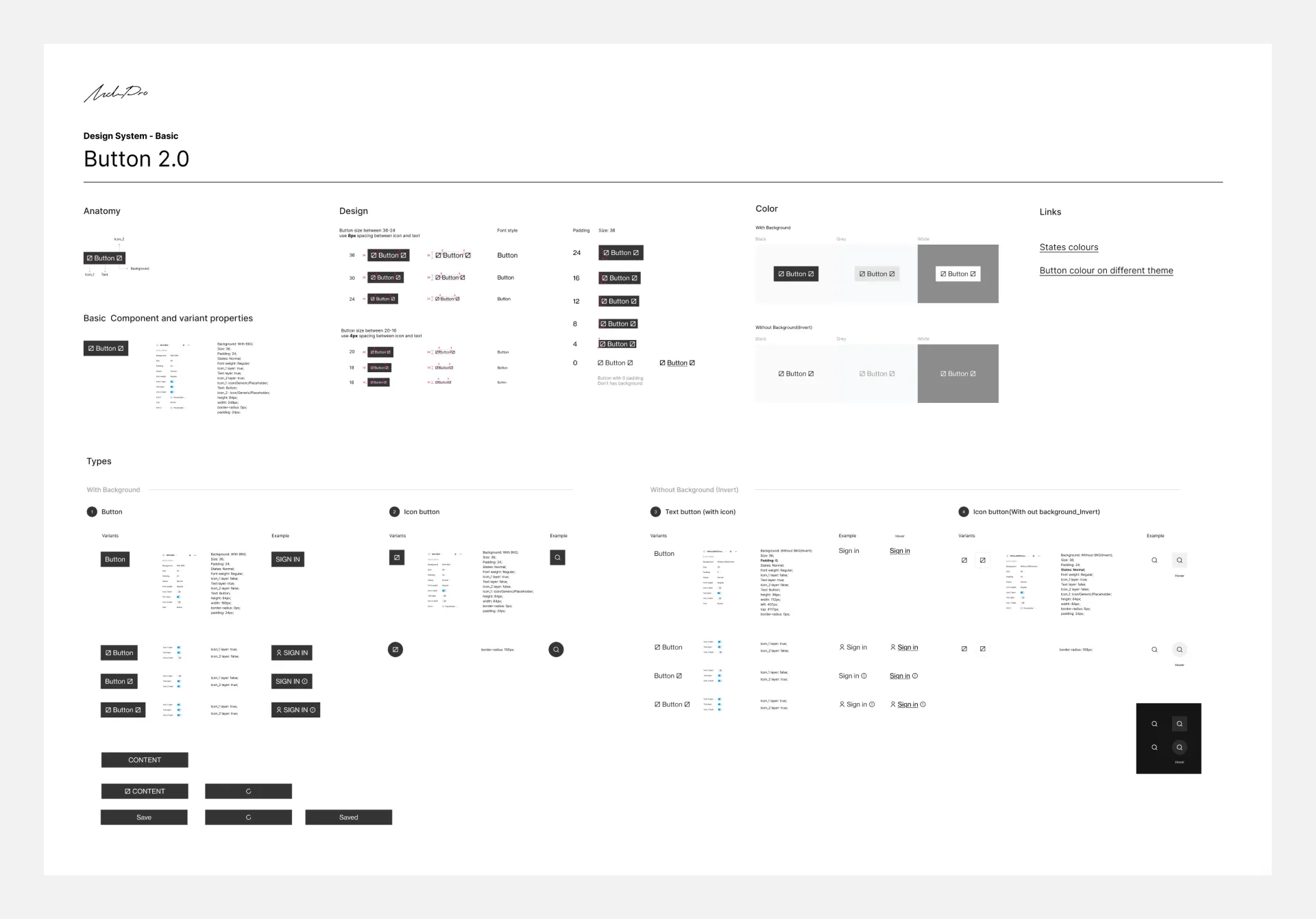
- Buttons
- Inputs
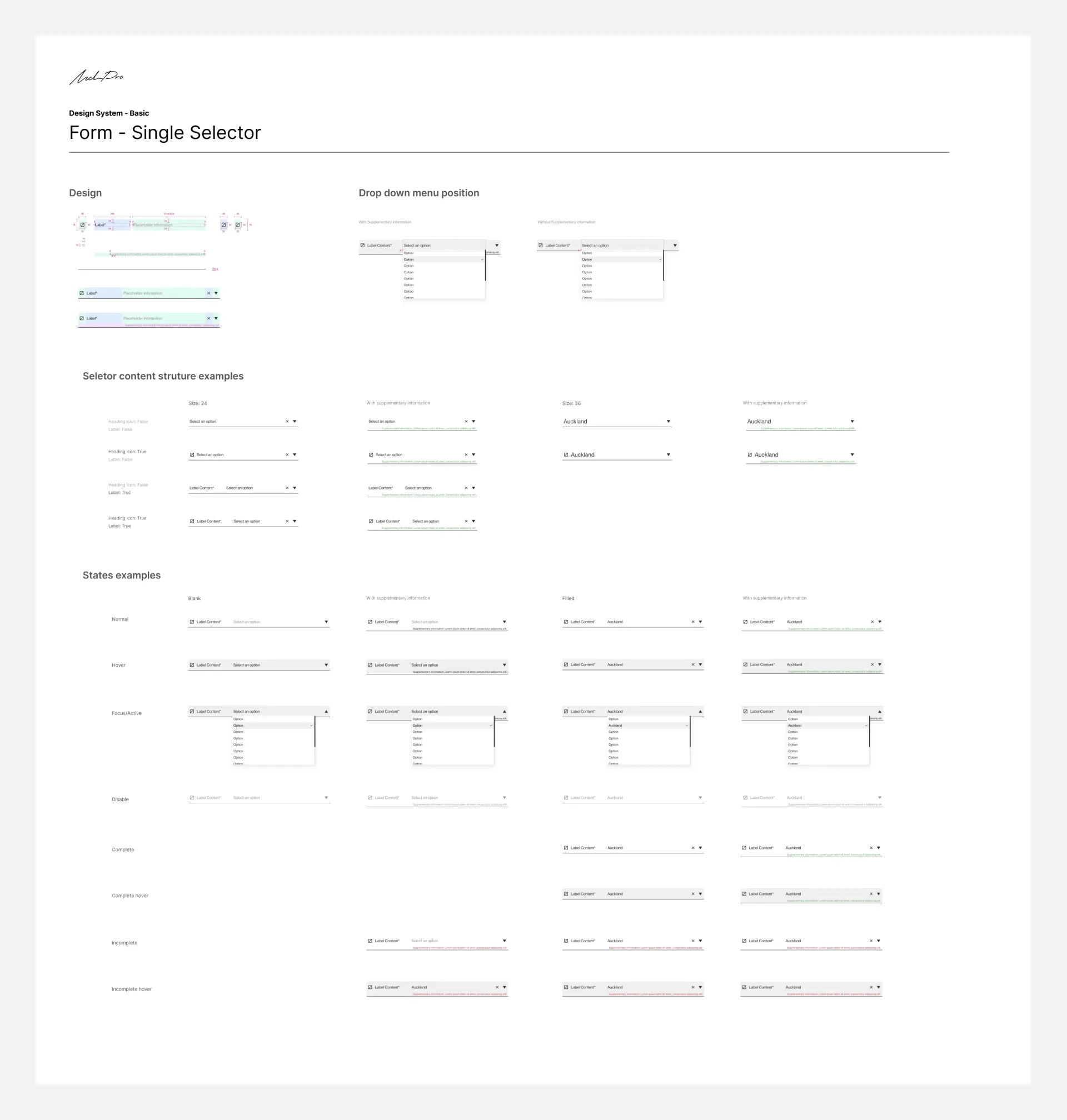
- Dropdown menus
- Tags
- Avatars
- Tooltips
- Checkboxes, Radios and Switches
- Toasts
- Cards
- Modals
- Others
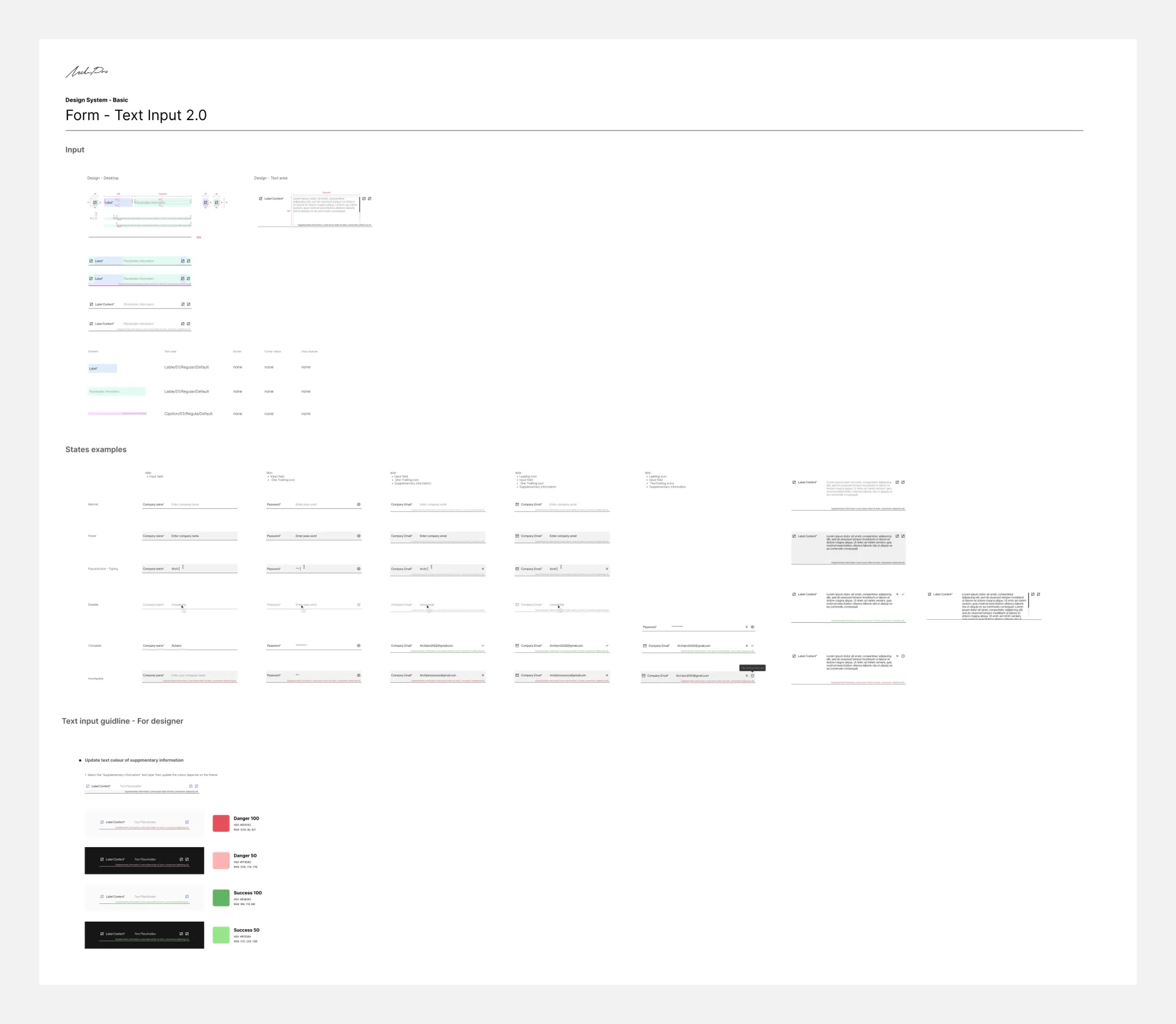
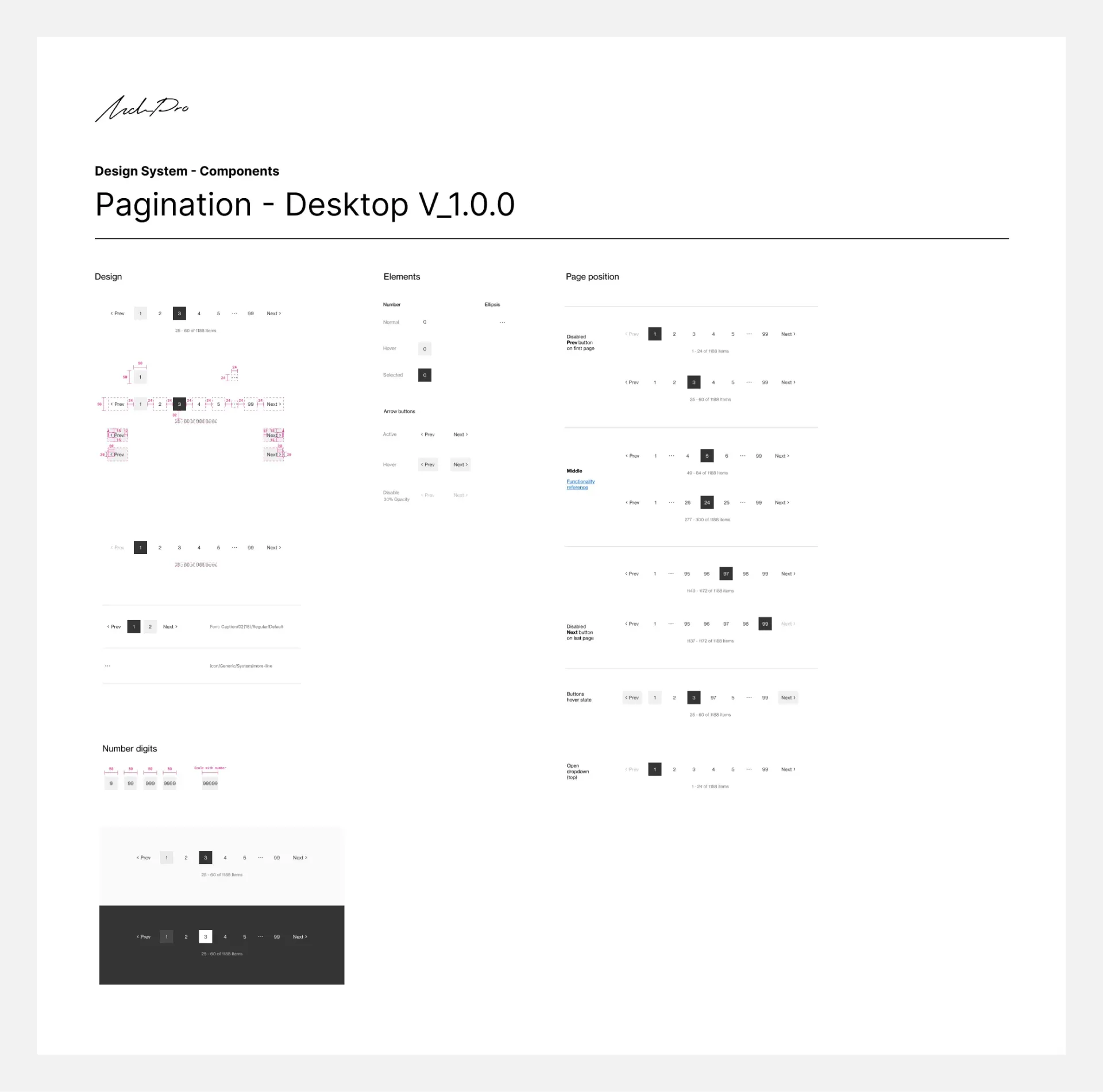
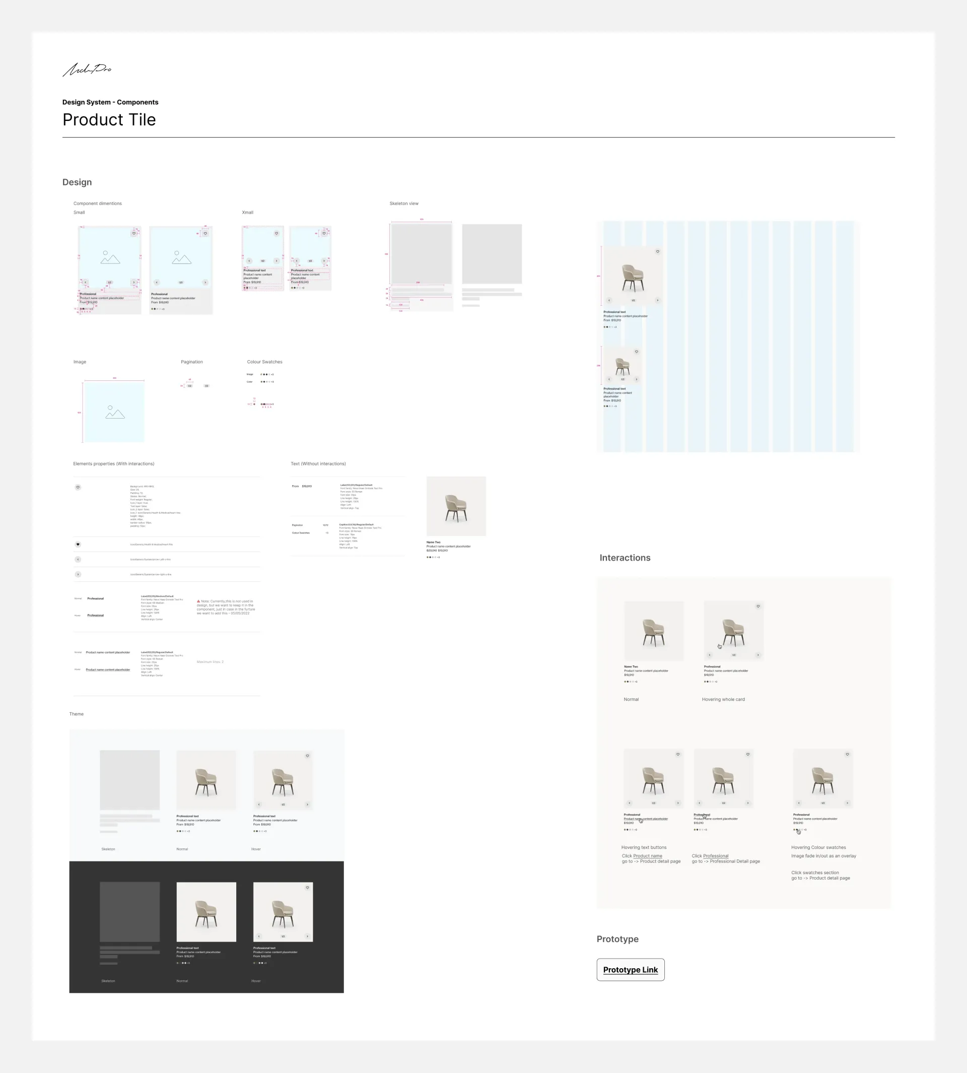
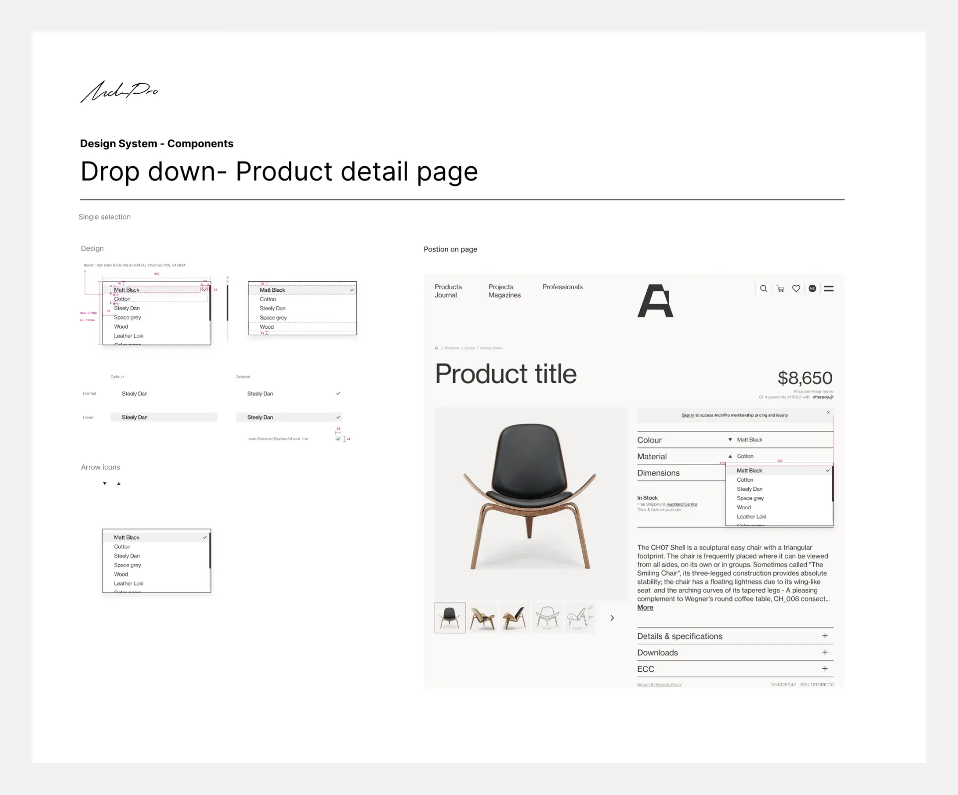
Some Screenshots Document the Usage of Styles and Components
Results
Outcome
- Reduced development time for new features by 50%.
- Increased design consistency across all products by 75%.
- Creating a design system may be a significant investment, but the long-term benefits are substantial.
- Creating a comprehensive design system that unifies products fosters seamless collaboration between design and development teams.
Reflection
It was an 'Everest' challenge. I learned much about resource management, coordinating moving parts, and syncing with developers. I am proud I convinced management to give the design system initiative a well-deserved try. The design system is an ongoing project, and we have essential components ready for easy adoption by any future team.