Building Automated Shipping for Product Suppliers and Shipping Companies
- Client
- ArchiPro
- COMPLETION
- 2022 - 6 weeks
- PLATFORM
- SaaS, E-commerce, Web App
- MY ROLE
- As the UX/UI Designer, I was responsible for UX research, wireframing, prototyping, and conducting usability tests. I collaborated with the design team, product owner, and engineering team throughout the project.
- TEAM
- Mustafa Sheikh(Senior UX designer), Laura Weir(Product Owner), and Marcel-Edouard Saville (Engineer)

The Context
ArchiPro is a one-stop hub for homeowners, professionals, and product suppliers across New Zealand and Australia for anything related to building. It's got everything from project and ad management to a marketplace where suppliers and professionals showcase their offerings. You can shop for products, hire architects, interior designers, and more - all in one place!
The Challenge
Manual forms were a significant source of inefficiency and inaccuracy in the traditional shipping process for suppliers. They often led to errors in weight or details, which created problems for shipping companies. To overcome this challenge, a creative solution was needed to simplify the process, increase accuracy, and improve the shipping experience for everyone involved.
The Solution
Developed a supplier business account order management system that revolutionises the shipping process by eliminating manual forms and errors, enhancing efficiency, and fostering seamless collaboration between suppliers and shipping companies. Provided accurate shipping information for buyers.
Research
User interview
We found the following gaps through qualitative interviews with product suppliers and shipping companies.
- The shipping process for suppliers was cumbersome, involving multiple manual steps such as contacting the shipping partner for quotes, confirming shipping prices to buyers, filling in the buyer's information on the shipping partner's website, scheduling pickups, and sending confirmation and tracking details. This called for a more streamlined solution to reduce manual effort and simplify the shipping workflow.
- The return process for buyers was complex. It involved contacting the supplier, arranging pickup with the shipping partner, and deducting shipping costs from the refund once the product was returned. This added to the overall complexity and time involved in processing returns, creating challenges for buyers and suppliers.
- Inaccurate weight or details provided by the supplier could cause hassle for the shipping company, resulting in delivery delays or additional costs for the buyer.
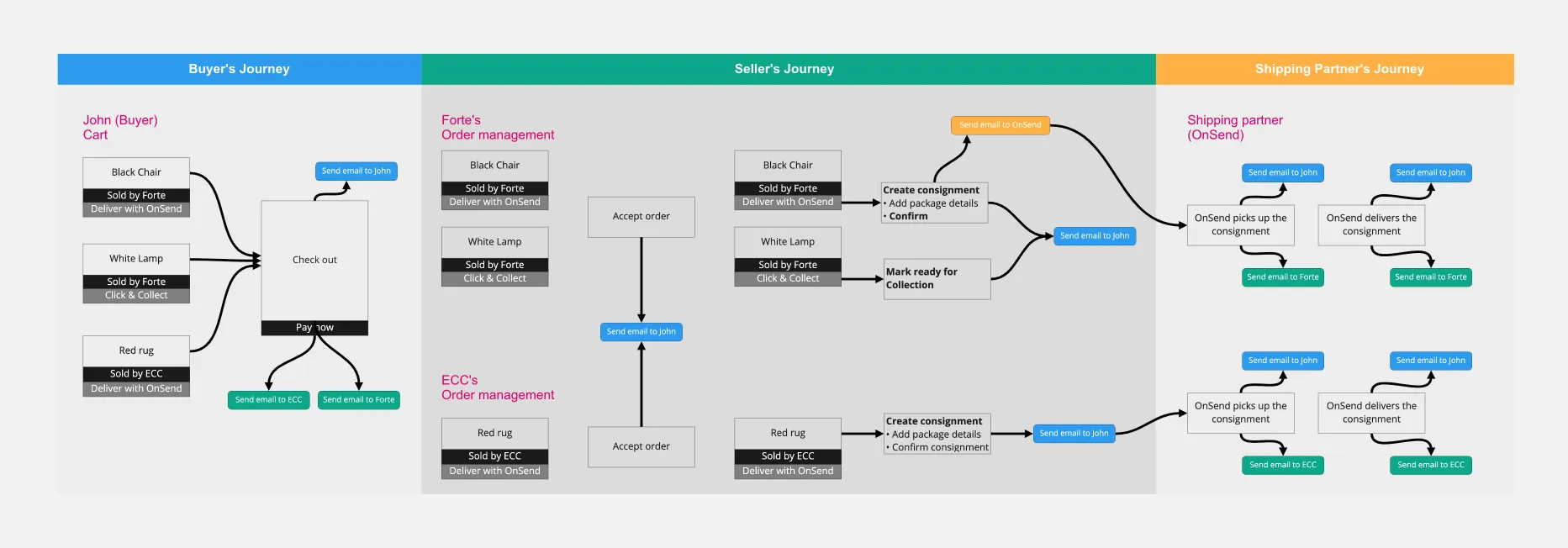
User Journey
To understand the user's frustration, we created a user journey map.
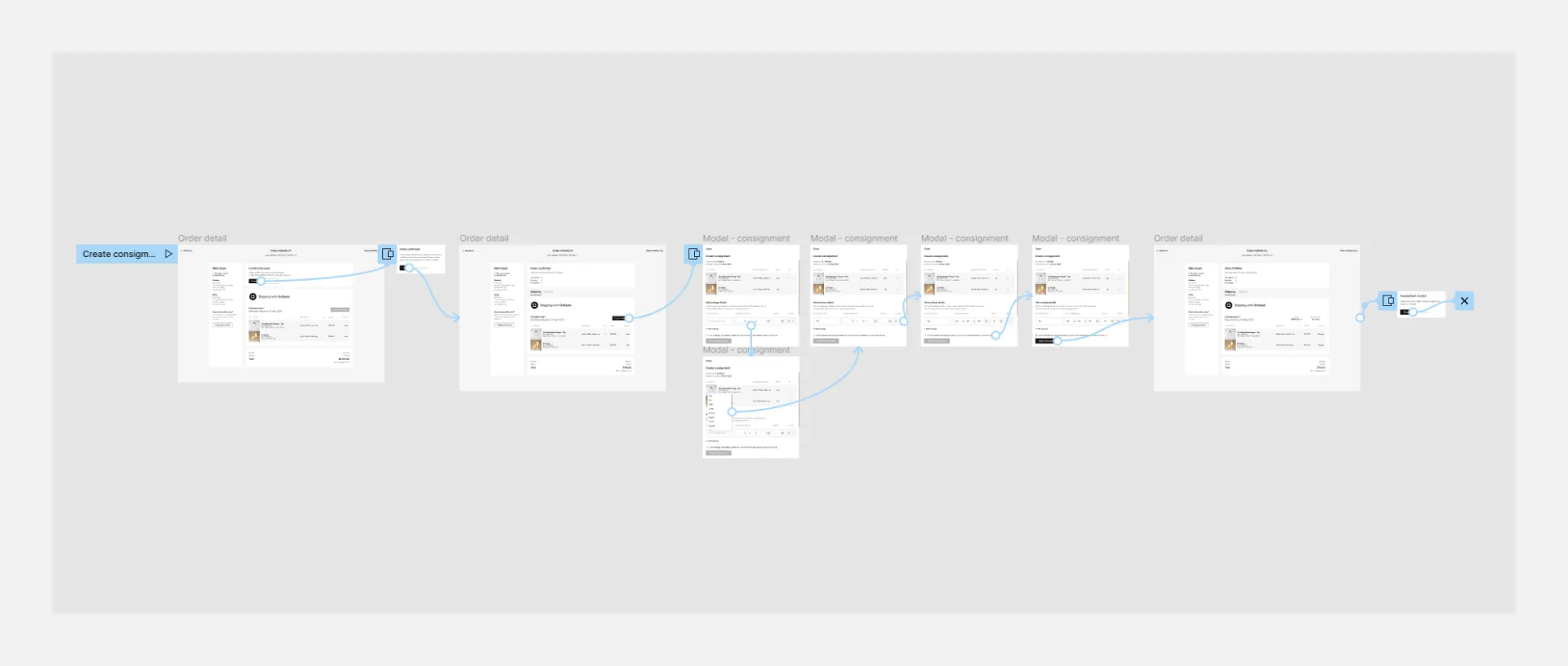
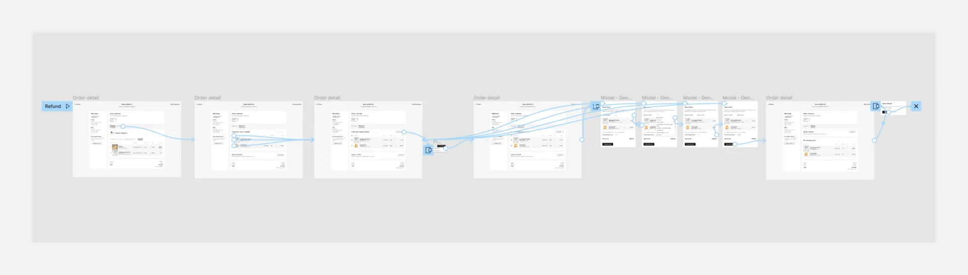
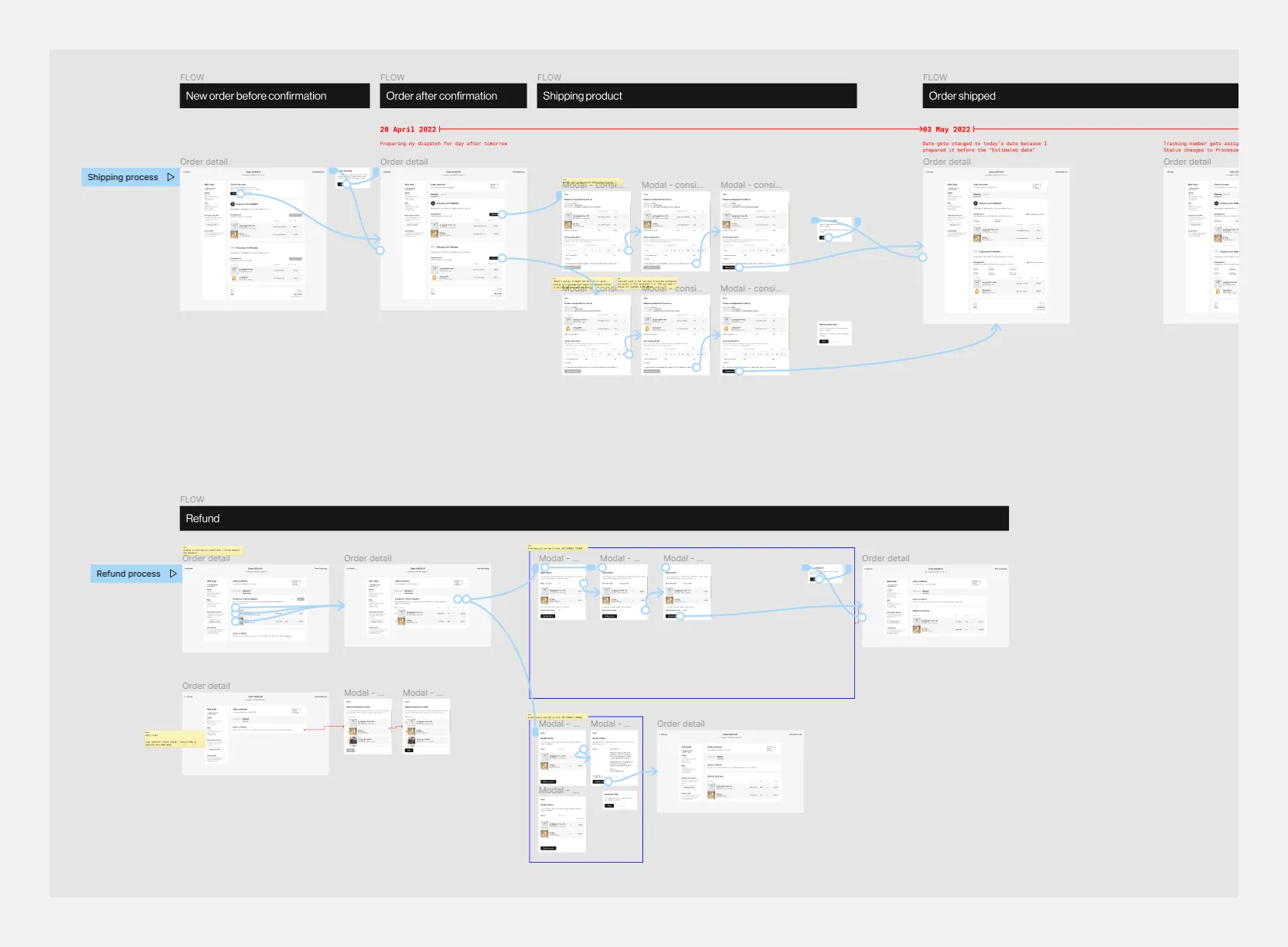
Wireframes & Prototypes
As part of my responsibilities for the project, I took the next step after solidifying ideas and creating high-fidelity wireframes based on initial concepts. This included wireframing and creating a clickable prototype to visualise the proposed solutions. A product requirements team was established, specifically focusing on improving the shipping process for suppliers, creating a consignment for the shipping company, and streamlining the refund process for suppliers who received customer refund requests.
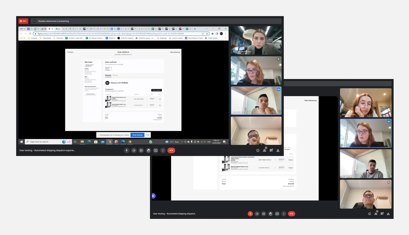
Usability Testing
I completed the clickable prototype, and it is now ready for testing. These high-fidelity prototypes will allow us to evaluate the usability and functionality of our design. Before conducting the testing, we created a usability testing plan and checklist that included all the information and goals we wanted to achieve.
Testing objective:
- Observe how participants navigate the shipping and refund processes to accomplish their goals.
- Test and see if participants get to the end of their tasks using different methods.
- Identify any point of confusion regarding the whole shipping and refund process.
- Get feedback from participants on the usability of the shipping and refund process.
- Test whether the shipping and refund process is user-friendly and easy to use.
Tasks:
- Confirm the order, create a consignment, and enter the package details to ship the item to the customer.
- Manage refund requests from the customer and apply for refund request approval.
Testing Insights
This round of testing involved five participants who agreed to join a virtual Zoom call and screen share while testing the prototype.
Key Findings:
- One participant liked the shipping and refund process, which is user-friendly and easy to use.
- All participants navigated through the shipping and refund process successfully.
- Three participants took a while to finish all the tasks.
- Three participants pointed out that a few copies need clarification.
- Some words chosen need to fit into people's understanding.
Gathering feedback for the shipping process
- Some users may not understand the term "Create consignment" when requesting a pickup from the shipping company. We recommend changing the button to "Ready to pick up" to avoid confusion. This way, the users can indicate that their goods are packed and waiting for collection at their warehouse.
- The modal title "Create consignment" may be unclear for some users who are not familiar with the process. A more descriptive title would be "Prepare consignment for pick up," explaining the modal's purpose and outcome. This would help users understand what they need to do and what to expect next.
- Some users suggested showing the product's pickup location on the modal to help them plan their trip and ensure clarity. This is a valuable suggestion, and we are actively working on implementing it.
- To avoid confusion, we recommend updating the button label from "Ship consignment" to "Request pick up" to indicate that the goods are waiting for collection at the warehouse.
- One possible improvement for the form is to include two fields: "Estimated consignment size" and "Actual consignment size". These fields allow users to enter their expected and actual package dimensions, which helps them complete the form faster and more accurately.
- Recommend changing "Dispatch on 03 May 2022" to "Consignment created on 03 May 2022 and ready for pickup."
- Some users suggested adding a more appealing label element to inform the user about the process of "Pickup and sending to shipping company".
Gathering feedback for the refund progress:
- Some users may find the "Action refund" dropdown and "Issue refund" buttons confusing as they appear to be the same. To avoid confusion, it is recommended to change the "Action refund" dropdown to display two buttons, "Decline" and "Approve", and convert the "Issue Refund" button into a link instead of a button, making it less prominent.
- Some users may find it confusing to land on the "Refund" tab and see the subtotal, delivery, and total. To avoid confusion, it is recommended that this information be removed and only the "Shipping" tab displayed.
- Some users may find the wording "Refund approved" confusing. Changing it to "Refund items" is suggested to align with the previous action button "Refund item" and provide a better user experience.
Priority Revisions
After conducting usability testing and gathering feedback, we carefully reviewed and prioritised the recommendations. Revisions were made to address the input, ensuring the design met the users' needs and aligned with the project's goals.
Final Design
After conducting usability tests and making necessary revisions, the design is ready for development. To ensure effective communication with developers, I have redlined and organised my design deliverables using Figma for handoff. I am also prepared to assist with any follow-up questions from the development team to ensure smooth implementation of the design.
Results
Outcome
- Buyers can count on 100% accurate shipping prices.
- Real-time tracking using the On-send shipping company API.
- Reduce dispatch processing times by 70%.
- Reduced customer inquiries, providing more precise shipping information for buyers, resulting in increased user satisfaction by 33%.