Redesigning the AttitudeLive Website for Accessibility
- Client
- Attitude Live
- COMPLETION
- 2017 - 6 weeks
- PLATFORM
- Responsive Website
- MY ROLE
- As the Senior UX/UI Designer, I managed the entire project, covering UX research, site architecture, user flow, wireframes, art direction, UI design, prototype, and usability testing. I also collaborated with the design and development teams.
- TEAM
- Maak Bow (Creative Director), David Huai(Engineer), Eva Lee(Engineer), Andy Han(Engineer), and Tina Matulic(Account Manager).

The Challenge
AttitudeLive aims to create a responsive website that aligns with its values and offerings to the community. However, we must update the website to reflect AttitudeLive's creative expertise. Additionally, it seeks to solidify its position as the leading source for disability information, discussion, and thought leadership in New Zealand, increasing community participation and engagement.
The Solution
AttitudeLive needs a compelling, user-friendly, and accessible website for delivering information and resources to the disability community in New Zealand, including a custom homepage feed. Designing a WCAG 2.0 AA-compliant website with accessibility in mind is crucial for an excellent user experience.
Research
We didn't have a budget for research for this project. Still, recognising the importance of catering to our target audience, we knew we had to complete this step. Thankfully, we found valuable resources and guidelines from organisations like the Nielsen Norman Group, which offered techniques for designing this website for users with visual, auditory, motor, and cognitive disabilities who rely on assistive technology. Additionally, we referred to the WCAG 2.0 AA guidelines.
User interview
We conducted user interviews with company stakeholders and people with disabilities to understand business and user users" needs. Below are some of the answers we received.
Business:
- Accessibility to people with disabilities and mobility restrictions.
- Having the power to configure the content through the website.
- Raise brand awareness - a site that WOWs.
- Support and attract funders.
- Easy management administration CMS.
- Create user-driven content and crowdsourcing content to build the community.
Users:
- Easy-to-navigate website.
- Able to increase the website font size for readable purposes.
- Designing the website for visual, auditory, motor, and cognitive disabilities who rely on assistive technology.
Define
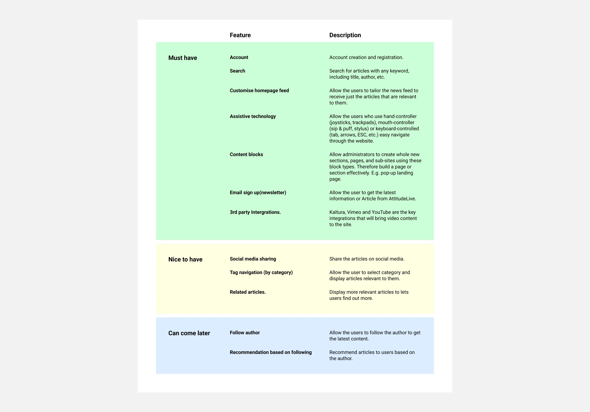
After analysing data collected from company stakeholders and individuals with disabilities, we built a list of the website's critical features, prioritising the needs of both the business and the users.
Next, we developed a product feature roadmap incorporating all the essential features identified through our analysis. This ensures the website functions efficiently and aligns with the project's high-level goals and objectives.
Information Architecture
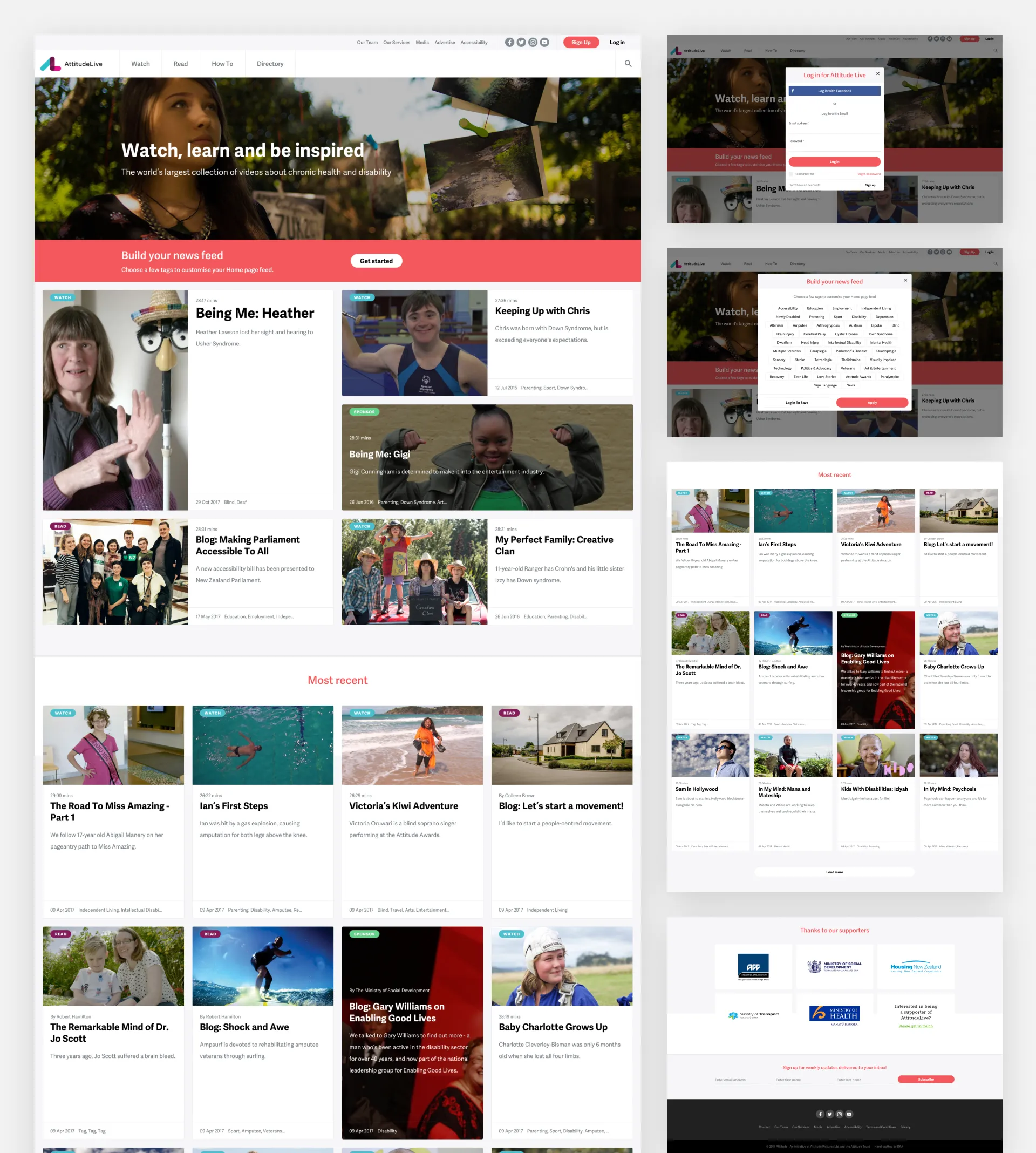
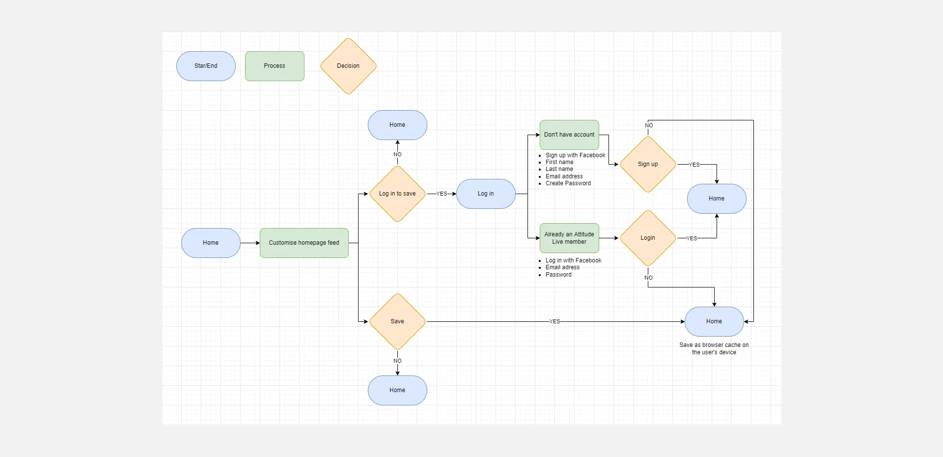
After defining the website's features, we created a flow for the main tasks. We focused on developing a customised homepage feed for users, which we deemed crucial website functionality.
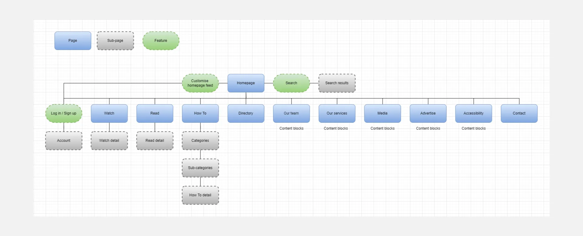
Sitemap
We created a sitemap to visualise the site's layout and content, prioritising a concise and straightforward information architecture as it was essential.
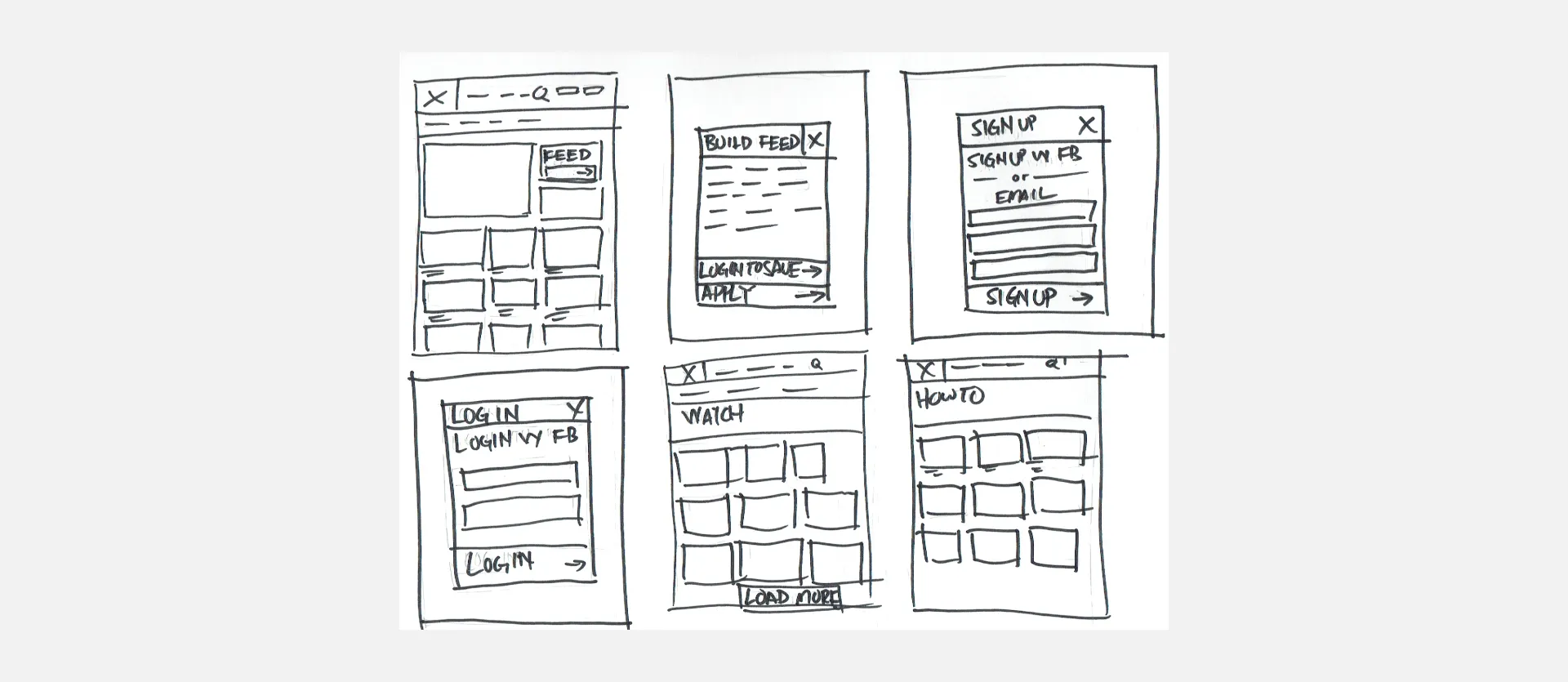
Sketching
Based on the sitemap and user flow, we started with quick hand-sketching of low-fidelity designs, ensuring that all the features, project goals, and research were included in the initial designs.
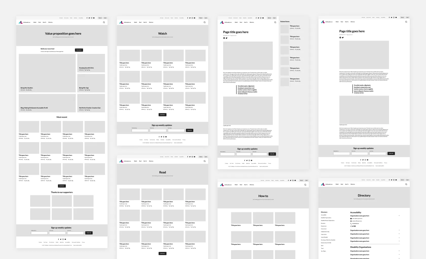
Wireframes
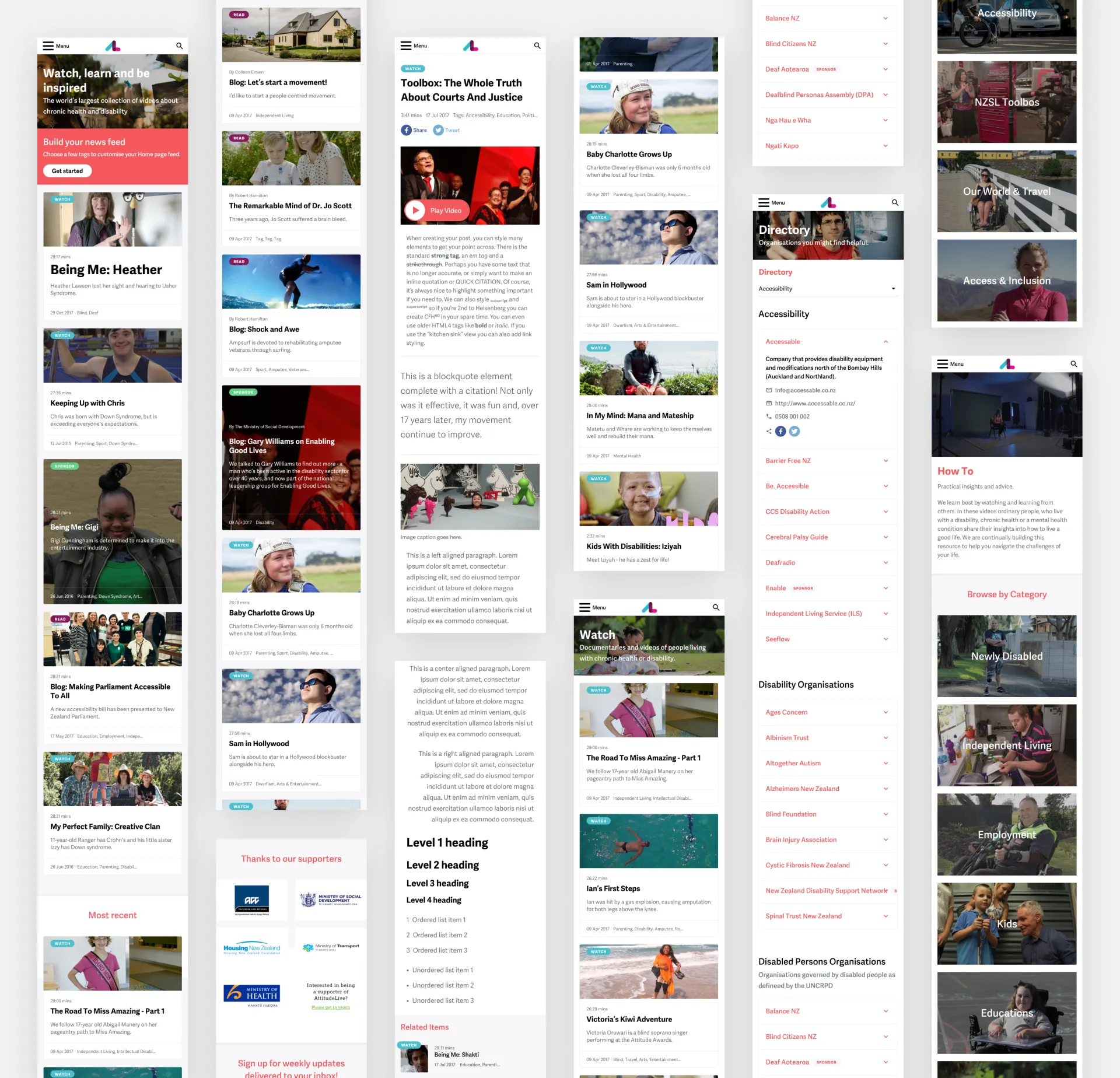
Once we had a visual direction for the layout, we added more details and precision to the sketches by creating mid-fidelity wireframes. Creating mid-fidelity wireframes helped us focus on visual consistency and hierarchy before applying styles to the design.
UI Refinement
We presented our mid-fidelity wireframes with a clickable prototype in our initial design review with the client. We received confirmation of their feasibility for development and approval for our proposed solutions.
We're creating a mood board to gather inspiration before developing our design system. Once we finalise the visual aesthetic, we'll establish a design system for consistent development across all screens.
Key Design Consideration
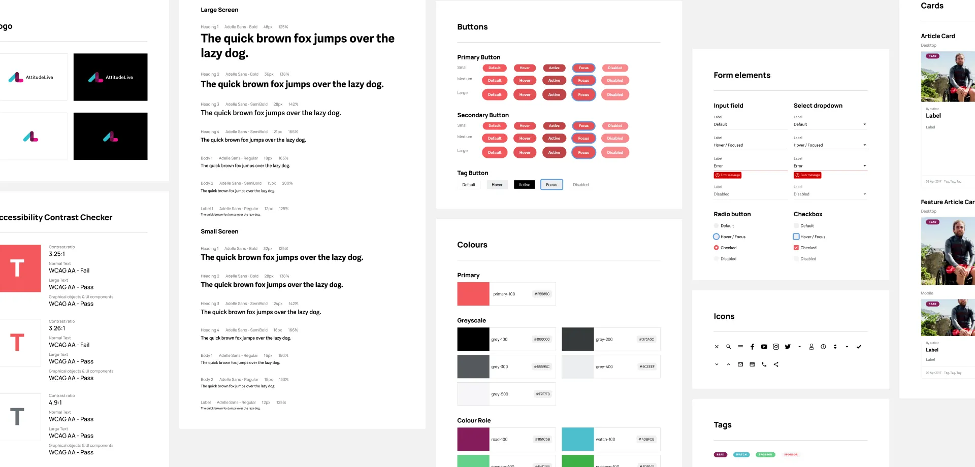
After reviewing the WCAG 2.0 guidelines, I created an accessibility checklist, prioritising visual design updates to the UI components.
- Make sure the keyboard focus is visible.
- Minimum contrast ratio of 3.20:1 between text and background.
- UI elements and graphics must have a contrast ratio 3:1 against their background.
- Don't rely solely on colour to present information.
- Use icons and buttons consistently.
- Text can be resized by 200% without loss of content or function.
- Content can be enlarged up to 400% without requiring dimensional scrolling.
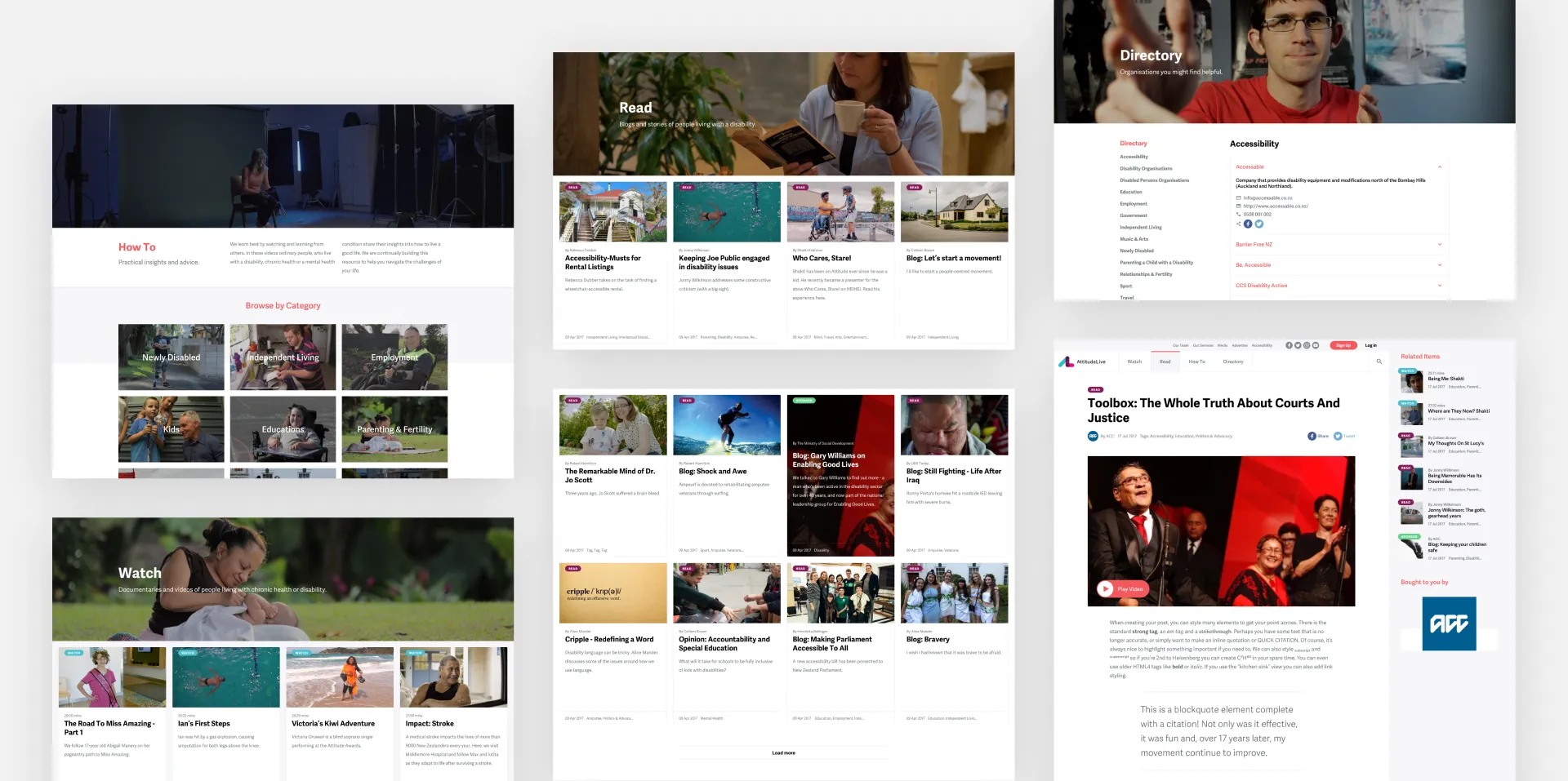
Establishing a design system
The designer and developer were part of the design process, along with accessibility. Once the proposed designs were approved, we defined essential elements to ensure a fast and consistent design throughout the project. This made style changes easier to coordinate later on.
Usability Testing
We refined the screens as a team, and I created a clickable prototype for usability testing, establishing our primary user testing objectives.
Testing objective:
- Observe how participants navigate throughout the website to accomplish their goals.
- Test and see if participants get to the end of their tasks using different methods.
- Test to see if the website is user-friendly and easy to navigate.
- Get feedback from participants on the site's usability.
Tasks:
- Find a button to create a custom feed on the homepage.
- Find an organisation under the “Sport” category on the directory page.
- Create an account.
- Identify which one is “Sponsor” content on the homepage, and click on it.
- Identify which one is “Watch” content on the homepage, and click on it.
Testing Insights
Seven participants completed this usability test. They came to my workplace to do testing. I observed them and could assist at any point. Participants were timed on how quickly they completed those tasks.
Key finding:
- All participants found the website pretty easy to navigate.
- All participants liked that the "Get Started" CTA on the Homepage stands out; they clicked on it to create a custom feed.
- All participants accomplished creating an account.
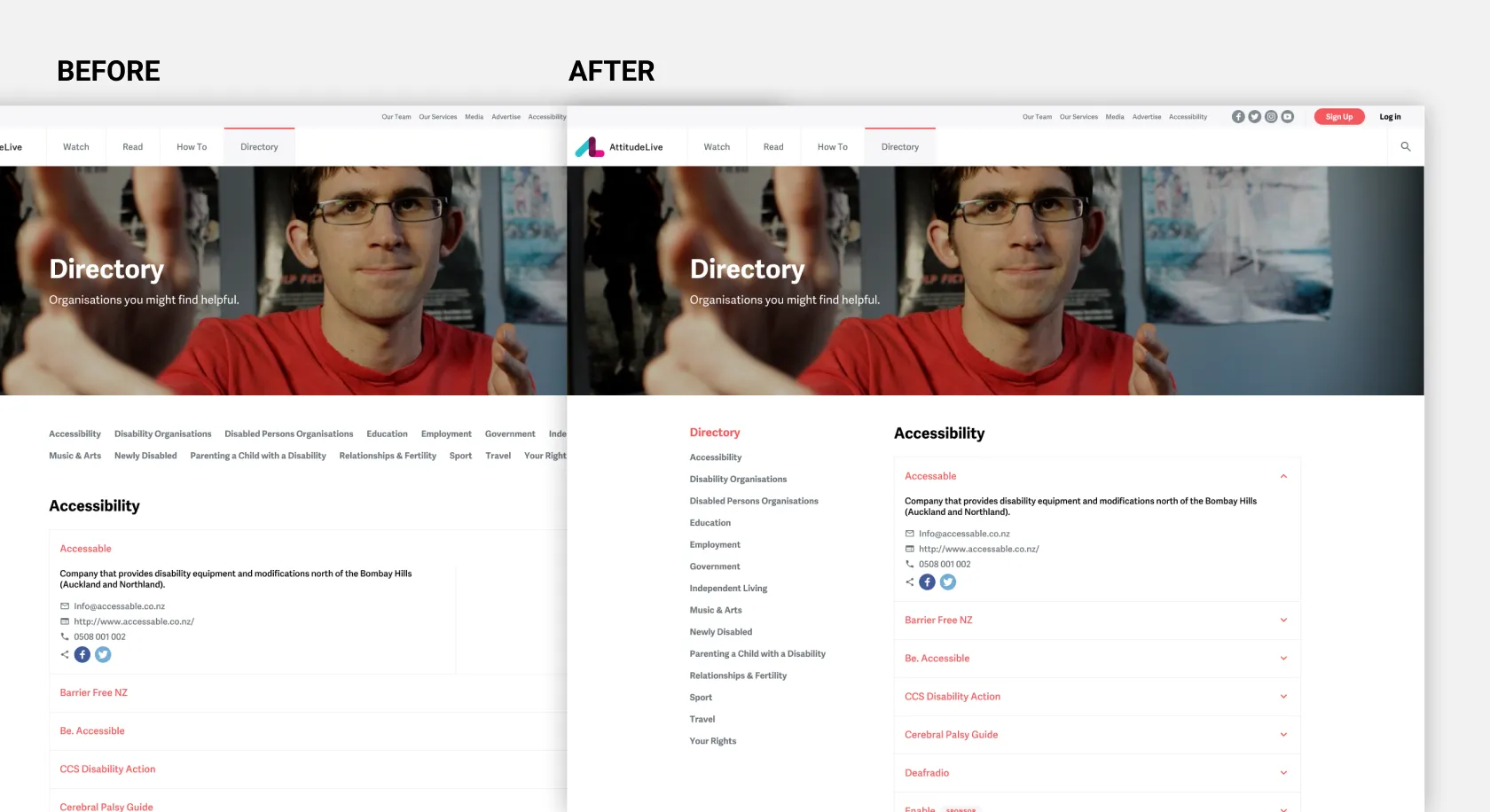
- Four participants pointed out that they dislike scrolling up and down to click the directory category.
- All participants liked the new UI design.
- One participant cannot identify the "Sponsor" content on the homepage.
Recommendation:
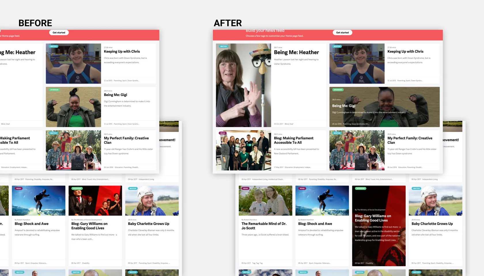
- Update the user interface of the "Sponsor" card to differentiate other cards.
- Make the section of the directory category sticky and move from top to left-handed like the sidebar.
Priority Revisions
After completing the usability testing, I made revisions based on the recommendations.
Results
Outcome
- The new designs successfully passed the disability community's compliance evaluation by meeting Web Content Accessibility Guidelines (WCAG) 2.0 AA standards. This ensured that users could easily navigate and browse the website, regardless of their abilities.
- With the new designs, a 30% increase in user engagement and a 20% lower bounce rate.
Reflection
- A design system with accessible components doesn't guarantee automatic accessibility. Holistic solutions at the application level are essential for a truly inclusive design.
- Continuous building and testing of components are essential for accessibility. Static mockups alone cannot guarantee an accessible experience. Understanding how a screen-reader user interacts with the application helps identify and address user experience gaps.
Recognition
I want to thank our fantastic team and valued client for their hard work and dedication. Together, we have achieved a significant milestone—winning the award!
Designer Institute of New Zealand Best Design Awards 2017 Gold - Public Good Awards.
Design Highlights