Designing an E-commerce Responsive Website for Personalised Storybook For Children
- Client
- JVNZ
- COMPLETION
- 2017 - 5 weeks
- PLATFORM
- E-commerce, Responsive Website
- MY ROLE
- As the Senior UX/UI Designer, I managed the entire project, from UX research, user flow, site architecture, wireframes, art direction, UI design, prototypes, and usability testing. Our collaboration was critical to our success.
- TEAM
- Maak Bow (Creative Director), Eva Lin(Engineer), Andy Han(Engineer), and Christine Mata(Account Director).

The Challenge
JVNZ aims to expand its business by creating a website that offers a personalised storybook for children using pre-written and pre-illustrated stories. The final words and pictures of the story will be composed based on specific form fields chosen by the customer.
The Solution
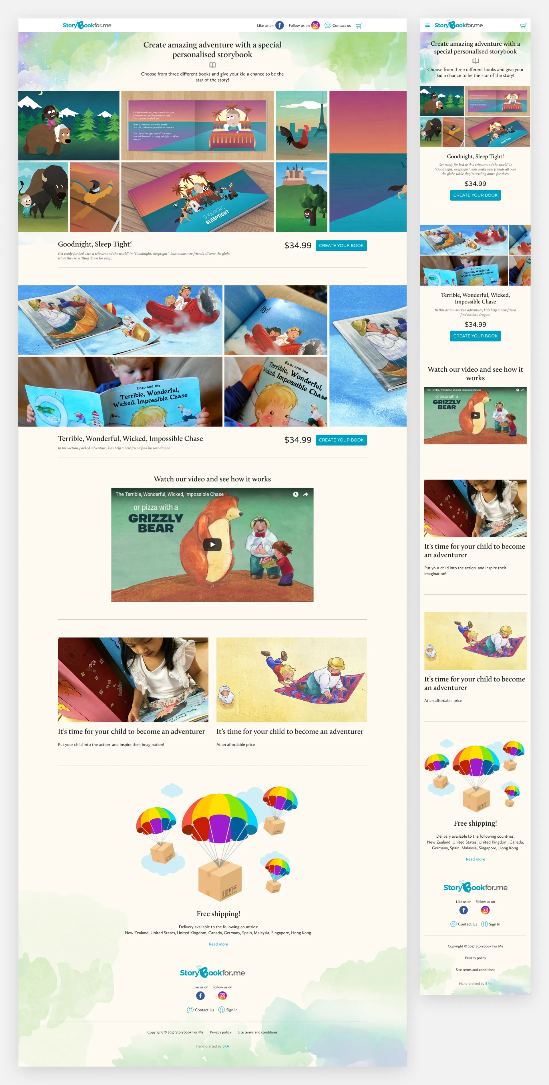
Design a responsive e-commerce website that is easy to use and allows customers to browse through all the books that feature a child's name and sometimes other personalised details as a central part of the story. These books are designed to engage children by making them the stars of their adventures. The design decisions were based on the insights gathered from user interviews and competitor research, which indicated a strong preference for easy navigation and personalisation options.
Research
Stakeholder interview
We started the design process by conducting a stakeholder interview to understand the client's problem, business goals, target audience, success metrics, and competitors. This involved in-depth discussions with key stakeholders. We also conducted user interviews with parents and children to understand their needs and preferences.
Business question
- What is the obstacle to personalised storybooks for children, and why are so few trusted online stores selling them?
- Who is the customer segment interested in personalised storybooks for children: children or parents?
- What is the measure of success in your business? Is it based on the number of customers who place orders?
- What is your business's Key Performance Indicator (KPI)? Is it the number of orders?
- What features do you want on your e-commerce website for a personalised storybook for children?
- How can we differentiate ourselves from our competitors?
- Why might someone purchase your product? Is it for themselves or as a gift?
User interview
I conducted user interviews to better understand the pain points and goals of those who shop for personalised storybooks for children online. These interviews helped identify target users and better understand their needs, values, and experiences.
Key finding:
- Users need an easy-to-navigate website.
- Users want to browse through all the different books and details quickly.
- Users need alternative ways of paying(PayPal).
- Users wish for free shipping and returns.
- Users need to personalise children's books with ease.
- Users wish to preview their personalised storybooks for juniors.
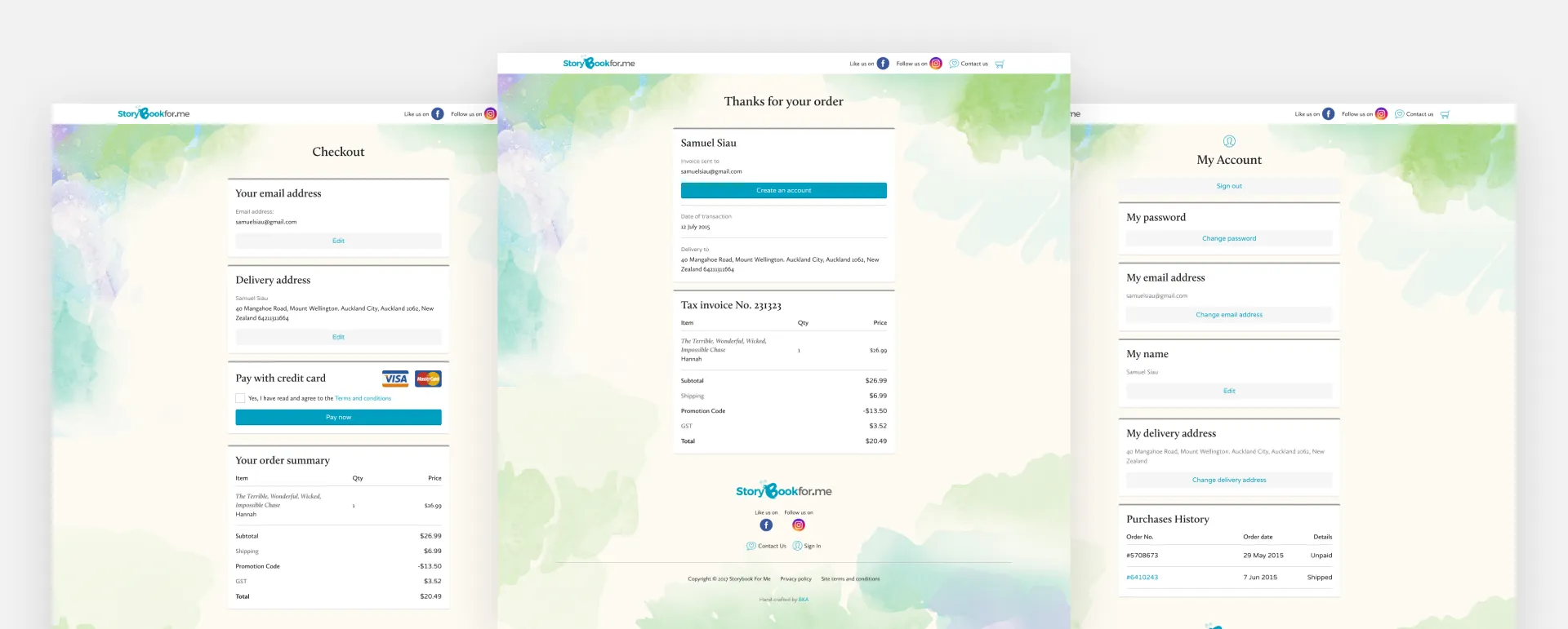
- Users want a faster checkout process.
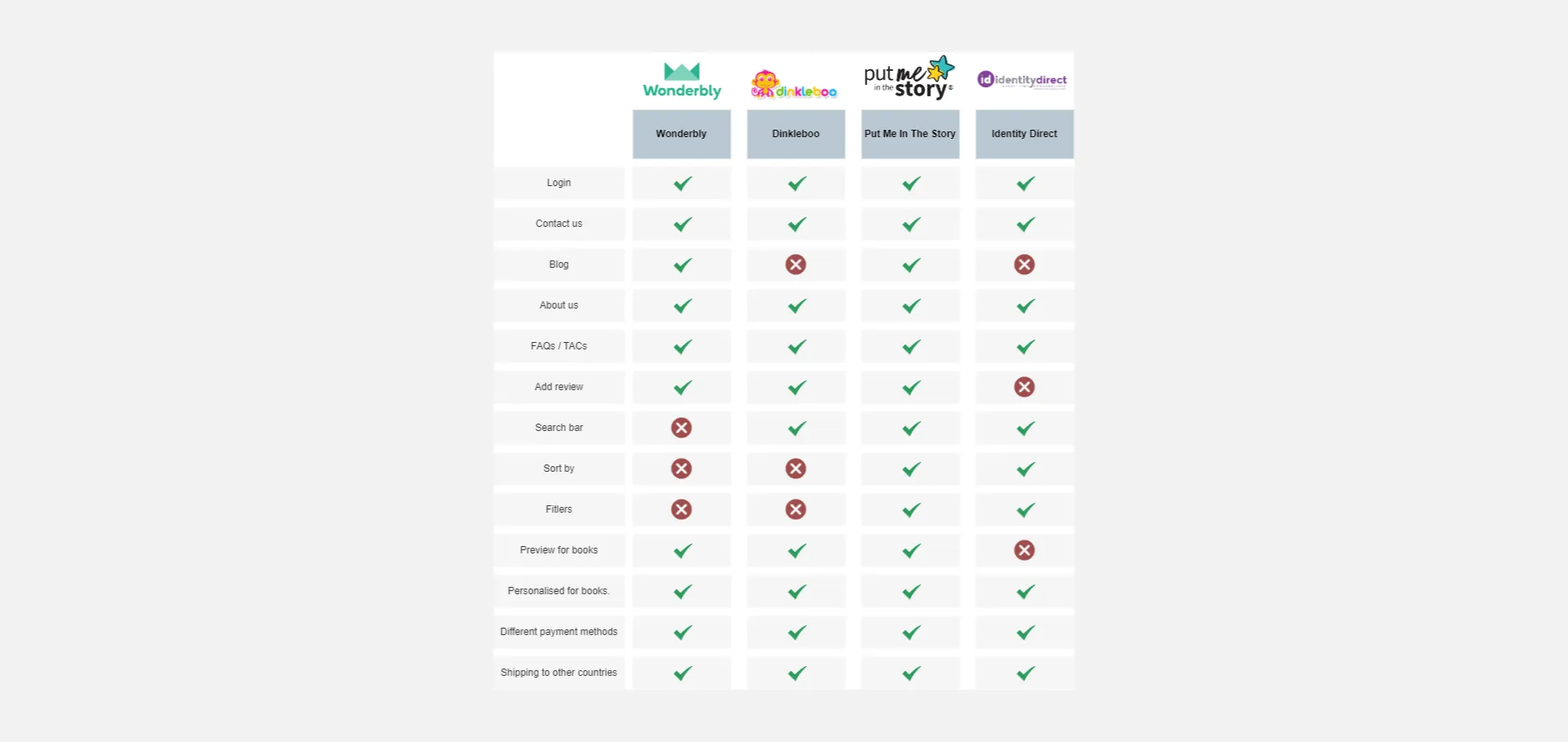
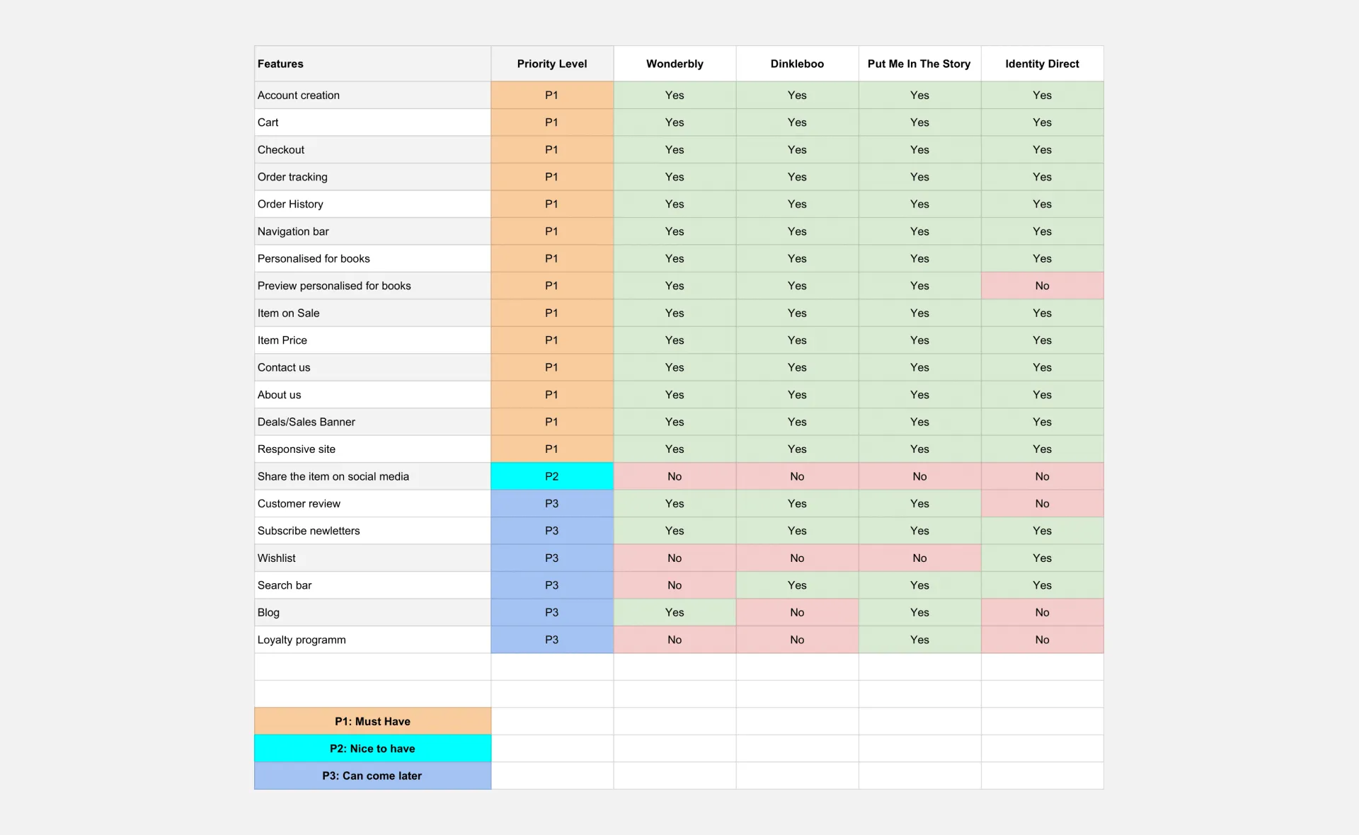
Competitor research
To create our e-commerce website, we left no stone unturned in researching competitors in personalised children's storybooks. Our thorough research provided helpful insights to identify standard features and opportunities for Storybook For Me to differentiate itself.
Ideation
We understand what we are designing, why, and for whom. This allows us to create a product that aligns with the client's business goals and meets user needs. We have developed a feature roadmap that prioritises features based on development, investment, and importance to business and user goals.
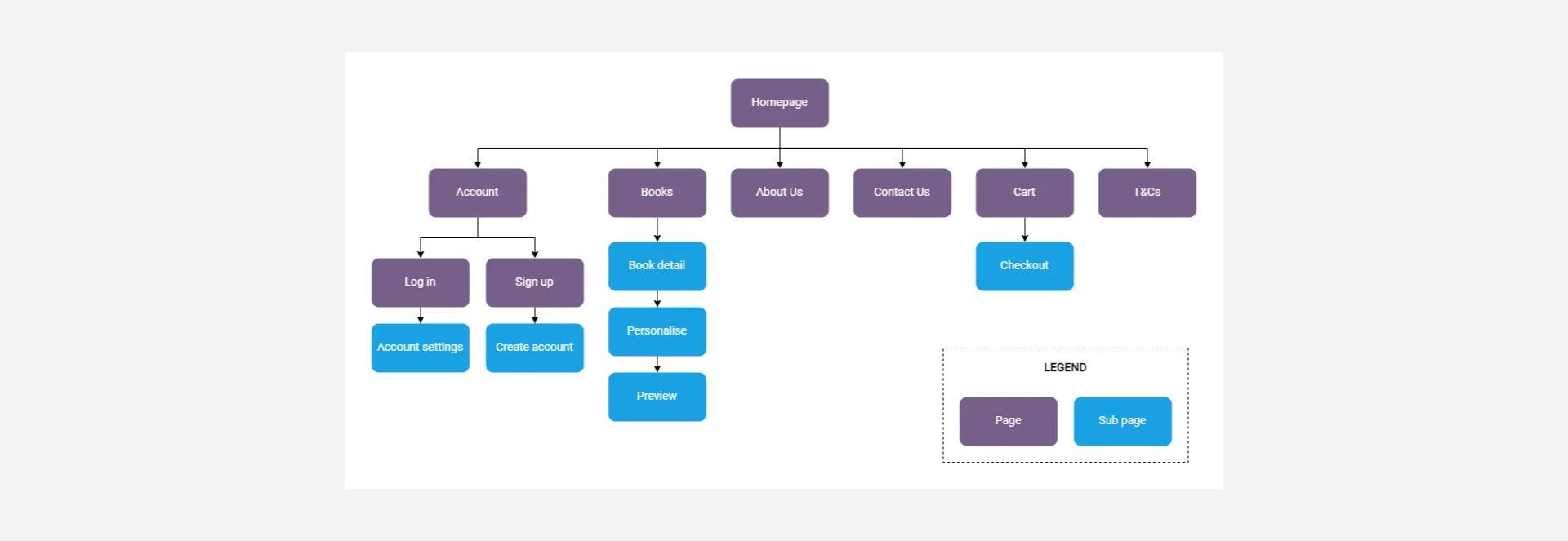
Information Architecture
We created a site map to define the overall structure of the website.
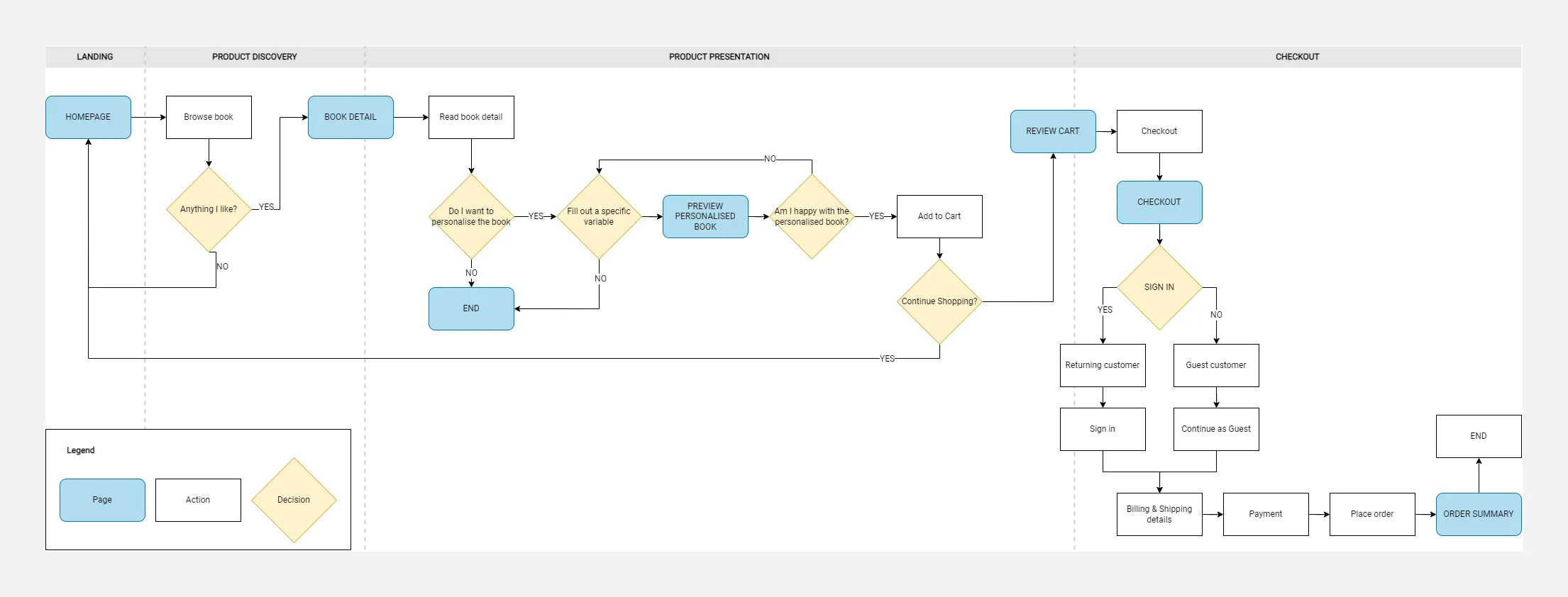
Before designing, we mapped out the user flow to outline the main steps the user would take. We analysed the user's online shopping journey to create a detailed user flow.
Wireframes
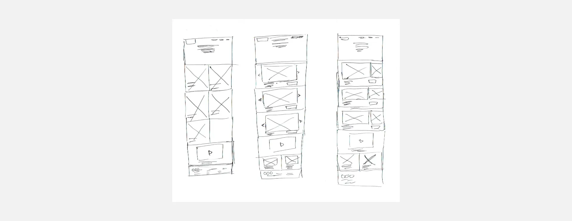
After organising insights from the ideation stage, we designed the website by sketching initial wireframes and creating low-fidelity wireframes.
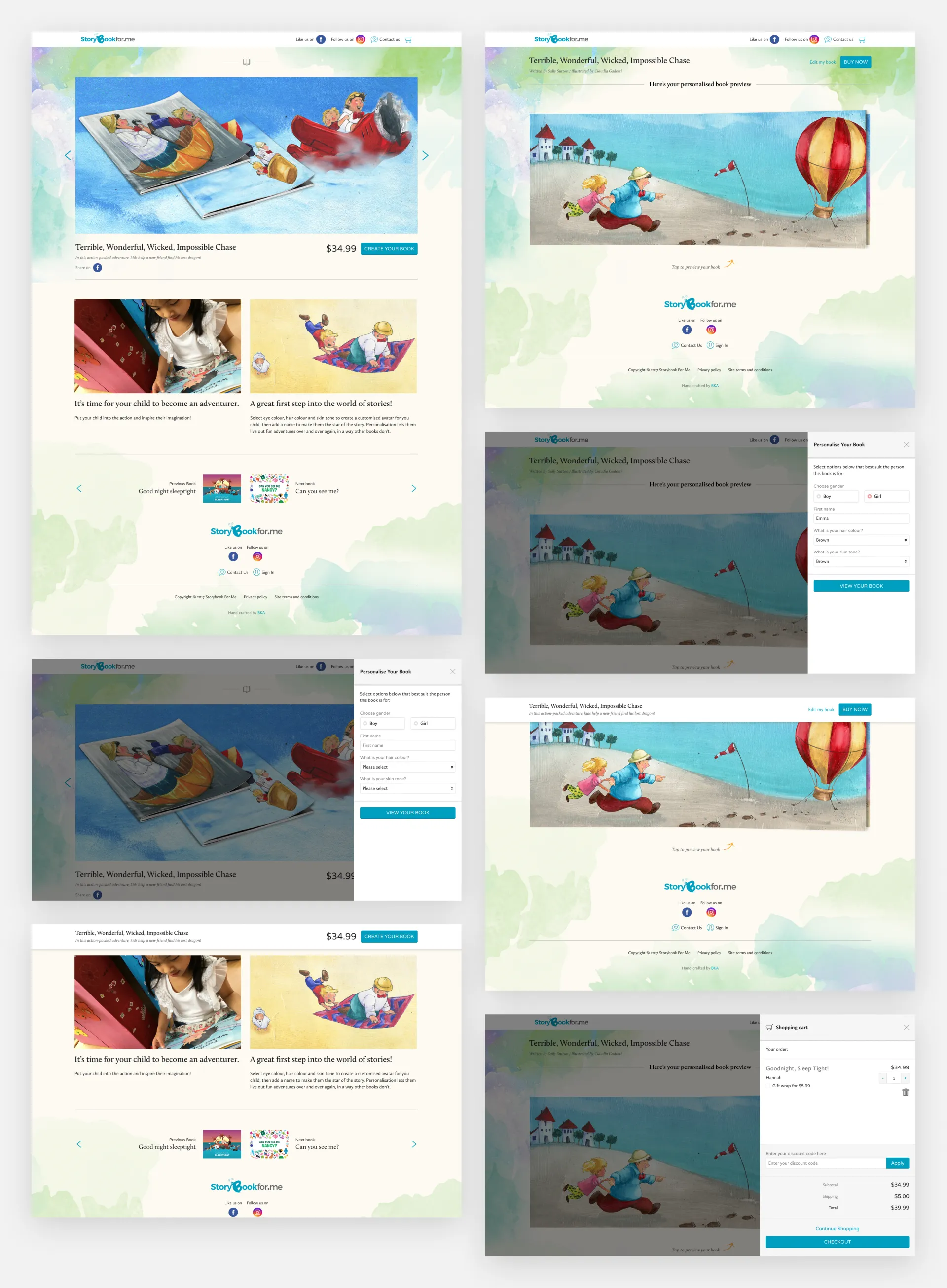
After deciding on the visual direction of the layout we wanted to pursue, our goal was to focus on the buying process, from when the user arrives at the homepage to find a book they would like to purchase to the checkout. We began wireframing some key pages informed by the user flow.
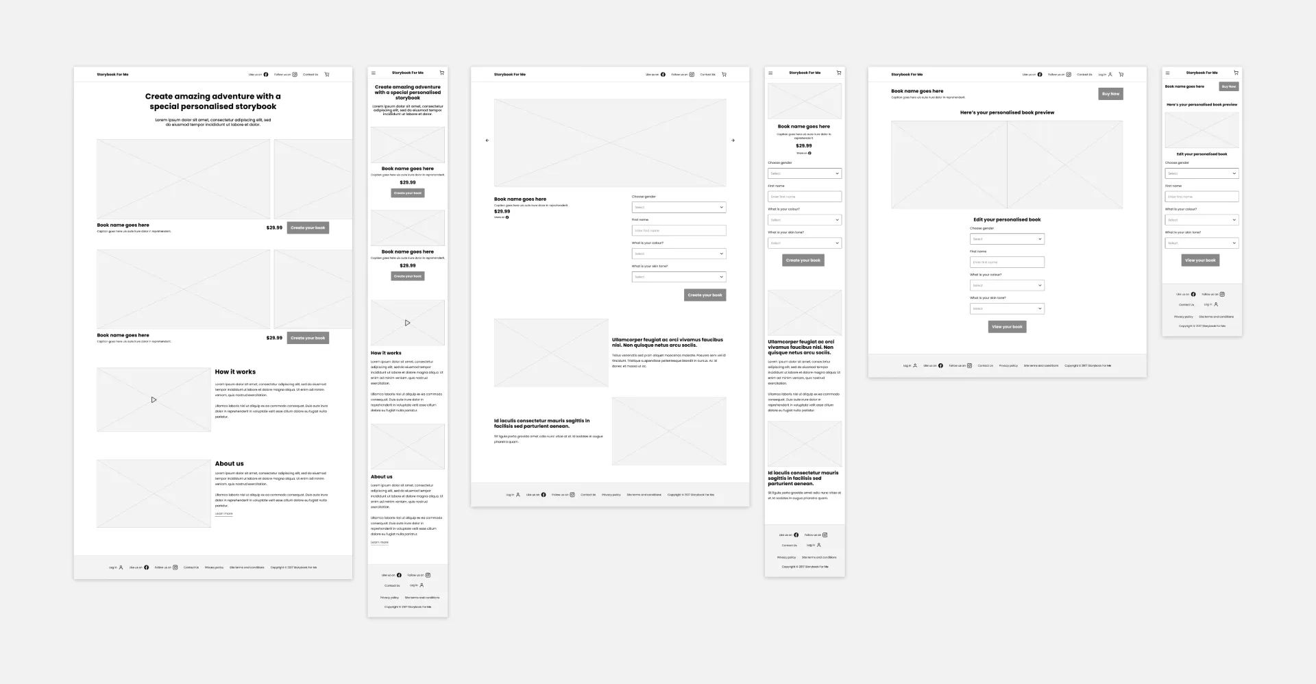
I created a mood board for inspiration before creating our design system.

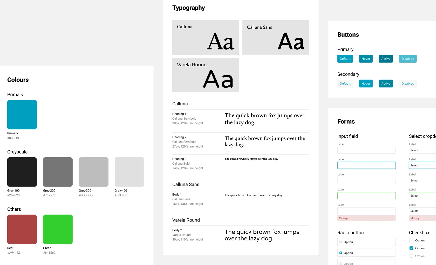
Design with the system
Once we agreed on the visual feel, we established a design system to ensure consistency across all screens and streamline the development process.
Usability Testing
I created high-fidelity wireframes and created a clickable prototype to prepare for testing.
Before testing, we created two user scenarios, each with a task to complete. We developed a usability test plan and checklist to guide our goals. The testing was conducted in a controlled environment, with each participant given a specific task on the website. We observed their interactions and collected feedback to identify any usability issues.
Testing objective:
- Tell me what this website does.
- Observe how participants navigate throughout the new site to accomplish their goals.
- Test to see if the website is user-friendly and easy to navigate.
- Get feedback from participants on the site's usability.
- Identify any points of confusion during the whole process of purchasing an item.
Tasks:
- Find one book, fill out a specific form field, and preview the personalised book.
- Preview the personalised book, add it to the cart, and continue to checkout.
Testing Insights
Five participants, three women and two men, completed this usability test. The participants ranged in age from 30 to 50, and they were all parents who shop online to buy items for their kids.
Key Insights:
- All participants can tell this is an e-commerce website selling personalised storybooks for children.
- All participants navigated through the site successfully.
- All participants completed finding a book, adding it to the cart and continuing checkout.
- 25% of participants liked the preview of their personalised book.
- 20% of participants liked to fill in the specific form field to personalise their book.
Pain points:
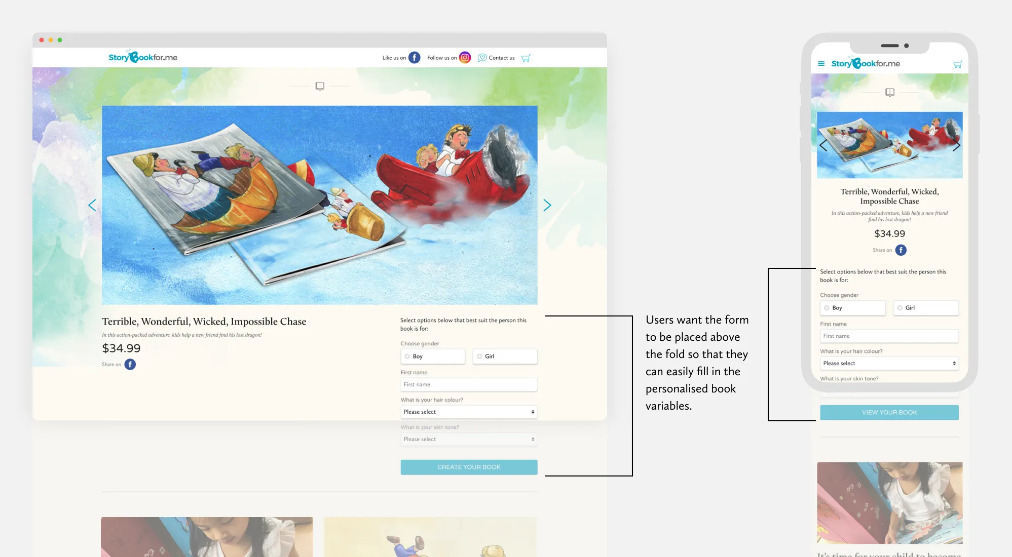
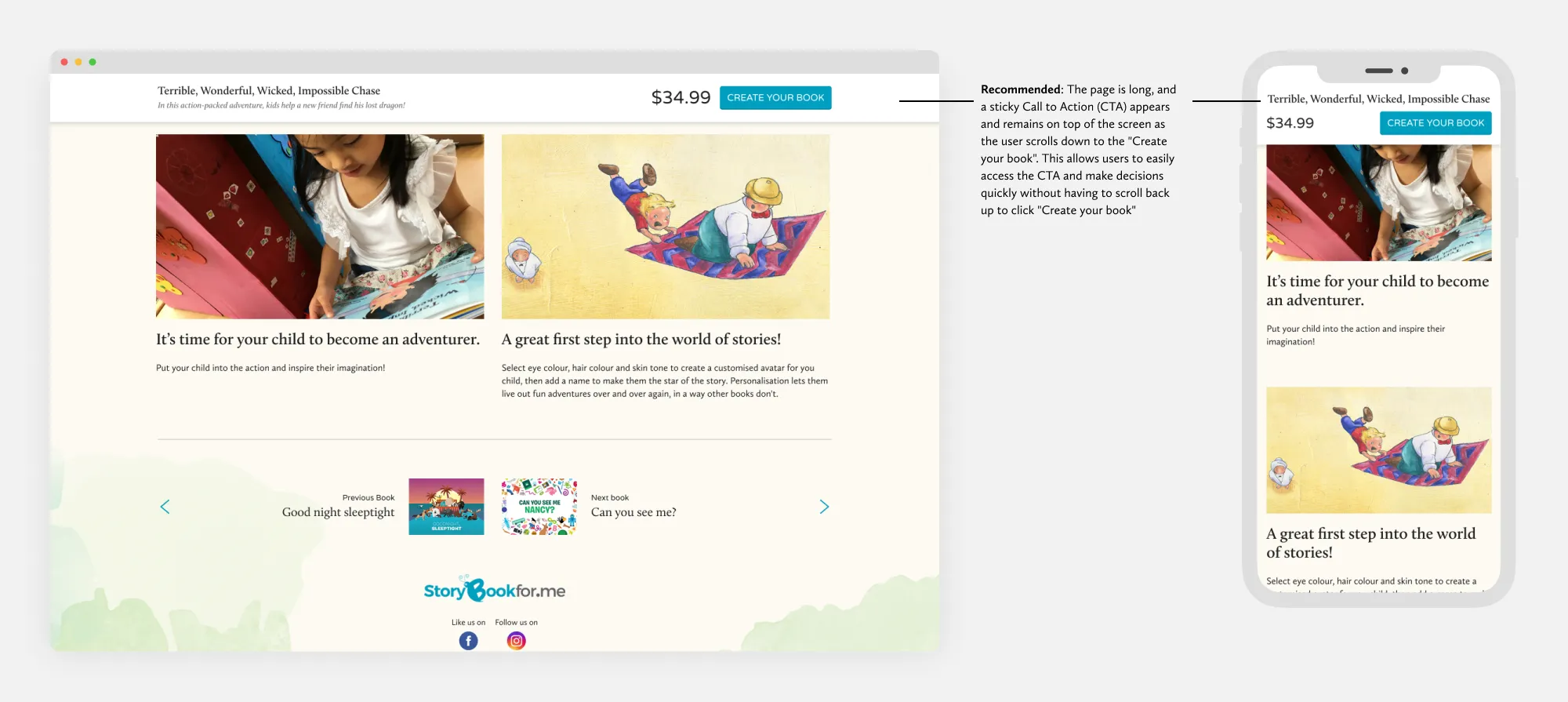
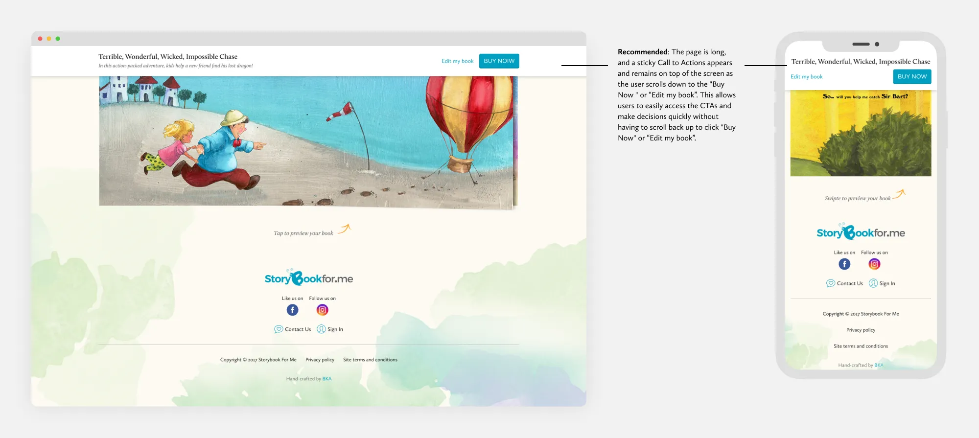
- Users want the form to be placed above the fold so that they can quickly fill in the personalised book form.
- The information provided on the home and book detail pages must be more comprehensive.
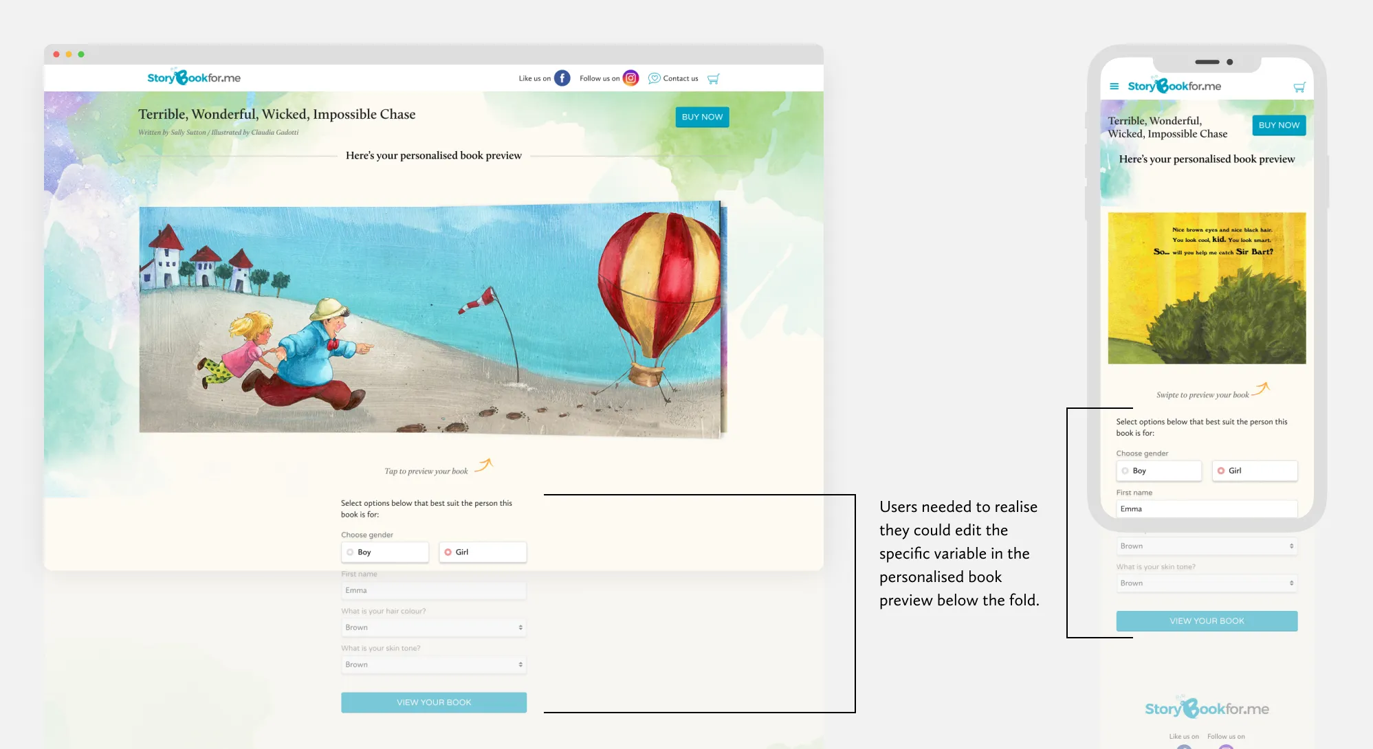
- Users needed to realise they could edit the specific form field in the personalised book preview below the fold.
Priority Revisions
After completing the usability testing, we revisited and revised the participants' top pain points. These revisions improved the user experience and addressed the issues identified during the testing. The impact of these revisions was significant, with users reporting a smoother and more intuitive browsing and purchasing process.
After iterating on the pain points I gathered, I tested again to see if these changes improved usability.
Results
Outcome
- We successfully shipped and deployed this project before Christmas, and the client received significant consumer orders. The best part is that we received feedback that the website was easy to navigate and quick to checkout.
- The website generated NZ$22k in sales revenue in the first month of Christmas. Additionally, we observed a 13% increase in the average customer retention rate in the four months following the Christmas period.
Reflection
- After completing my mid-fidelity wireframes, I planned to conduct prototype testing. However, I faced delays due to a shortage of participants, so I postponed the usability test until the high-fidelity wireframes were finished. In retrospect, conducting testing earlier could have helped identify user pain points sooner and save time when creating the higher-fidelity wireframes.
- This was my second e-commerce design project, where I used design thinking. I enjoyed conducting user interviews and usability testing, which helped me gain valuable experience and uncover usability issues. Overall, the project deepened my understanding of UX design and e-commerce.
Design Highlights